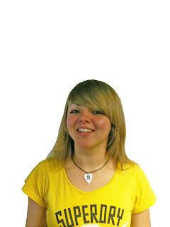
I started off with an image of a student against a whiteboard so it had an easy background to cut her out.
My next step was to then cut her out from the original image, I transferred this to a new document and copied it as a layer with a transparent background so it means it can be easily put onto a magazine.
The picture I now had was cut out but I felt it was a bit dark so I took the Brightness to 83 and the Contrast to -39, this made the student's features more noticeable which is better for a magazine cover.

I still felt the image's colours were a bit dark so I then decided to edit Shadows/Highlights. I had the Shadows at 72% and Highlights at 0%. I felt this worked well as it made everything that much brighter and easier to see.
The last thing I did to the image was to touch up little areas. If there were any noticeable spots or blotches I re-touched those by using the Eye-dropper tool and getting the same colour as the other areas and then air brushing on that colour in small amounts, not so it was obviously noticeable.
I then had a finished image which would be ready to go onto a magazine.
The rest of the images will be in order on a seperate post.

Great work Jamie. Using screen shot appropriately has really explained how you used and developed your technique. Well done.
ReplyDelete