About Me

My photo
Jamie, that's my name. I'm a Norfolk meterosexual who likes women outside his own family.

Monday, 27 September 2010

Music Magazine - Image Collection

Conception


For my music magazine I would want to have 3 artists on the front, I would say either 3 singles artists or one trio group. The main artist would be in medium closeup to show themselves off, I would maybe want a prop, something like a guitar. Then in parralell behind them, to the right and left, I would want 2 artists to be leaning on a prop and to be in Medium Long Shot. This would show the focus to the main artist.


Framing and Composition


I will take quite a few shots, maybe with all the subejcts together but then I would also want them to be seperate so if there is anything that needs changing on the subjects first I could do that.


Shot Distance


I will take the shots multiple times to ensure they are of good quality, I want the main image definately to be in Medium Closeup and have at least 2 artists to the left and right in Medium Long Shot. If I have 5 artists I would set them out to be in a triangle or pyramid shape with the point being the focal image, the extra 2 artists would be in Long Shot.


Mise en Scène


I want to edit them to be black and white, and taking the idea from my school magazine have a bit of colour from the image on the front to give that the focus attention. This could be a person, an item of clothing or just a prop within the picture.


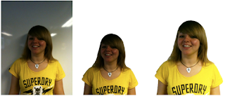
Photoshop Practise for School Magazine - Editing a Student (Images)

The images go in left to right from original to finished edit.
1. Original Image.
2. Cut out Image.
3. Brightness touched up.
4. Shadows changed.
5. Finished edit.


The last 2 images are larger than the others to try to show where on the face has been edited. look closely at the right side of the face, a few blemishes were re-touced.

Photoshop Practise for School Magazine - Editing a Student


I started off with an image of a student against a whiteboard so it had an easy background to cut her out.

My next step was to then cut her out from the original image, I transferred this to a new document and copied it as a layer with a transparent background so it means it can be easily put onto a magazine.

The picture I now had was cut out but I felt it was a bit dark so I took the Brightness to 83 and the Contrast to -39, this made the student's features more noticeable which is better for a magazine cover.

I still felt the image's colours were a bit dark so I then decided to edit Shadows/Highlights. I had the Shadows at 72% and Highlights at 0%. I felt this worked well as it made everything that much brighter and easier to see.

The last thing I did to the image was to touch up little areas. If there were any noticeable spots or blotches I re-touched those by using the Eye-dropper tool and getting the same colour as the other areas and then air brushing on that colour in small amounts, not so it was obviously noticeable.

I then had a finished image which would be ready to go onto a magazine.

The rest of the images will be in order on a seperate post.

Sunday, 26 September 2010

Classic Rock Review


Classic Rock is a British music magazine dedicated to the radio format of Classic Rock, it started out in 1998 and is a monthly magazine, very much like it's sister magazine, Metal Hammer. The magazine comes with a free Cd each issue, very much like Metal Hammer, it costs £4.99 and is 146 pages long. I am looking at the 150th Special issue for October 2010. With this edition you get a free 15 track Cd with the best new bands out there at the moment.

The front cover of Classic Rock is effective but simplistic, it uses a good colour scheme of Gold, Black and White, the mast head stands out very well and the main image for the 150 greatest debut album also stands out well. In the shops the Cd case is attached which adds to the attractiveness of the magazine. There is a very small use of Red, which is accompanied by White. The magazine is normal A4 size and has a glossy front, because of the glossy cover and the colours it shimmers in the light meaning that the magazine has the look of being 'holy' and a good buy for the consumer. It is more of an mass market product than Metal Hammer which is very much for a Niche Market, there are many listeners of the Rock genre so it's important many people like the magazine. From this front cover I can learn that if you get the finish right it can have positive feedback with the buyer.

Again like Metal Hammer you don't get straight to the contents page, there are about 6 pages of adverts, then again like Metal Hammer the contents is spread out on 2 pages which aren't double page spread. The contents for Classic Rock has 2 big pictures of something important to the left or right of the actual contents, the fact the contents is just one long list doesn't matter so much because of the big pictures. The first page of the contents is the big stories of this issue then the next page is the things that occur in every issue.

On the way to the main article there are a lot of adverts to bulk things out, these are all relevant things to the Rock industry.

The main article is about the top 150 debut albums of rock artists, there's no actual order to them which is quite good, as it doesn't create a conflict when reading it and satisfies everyone with the choices somewhere along the line. The article is also split into a few pages meaning it's not too much to read and you get an artist interview in the middle. I think this is a good idea because people don't get too bored with the article.

I like this magazine a lot, it's rather simple and has quite good articles, I will try to base my double page spread on their idea by having things spaced out into small bits of text so the reader wants to read on.

4/5 Rating

Picture Source: http://www.classicrockmagazine.com/news/the-new-issue-of-classic-rock-is-on-sale-now-11/

Metal Hammer Review


Metal Hammer is a british Metal magazine, it was first released in 1986 and is a monthly release. It costs £4.25 and 138 pages. Metal Hammer always comes in a plastic wrapper as it contains free gifts, though these seem to be the reason for the high price. I am looking over the October 2010 issue of Metal Hammer which has Avenged Sevenfold on the front cover. Inside the plastic wrapper you get a free Iron Maiden sticker, a book about Dave Mustaine and a 16 track Cd. It is aimed at a Niche Market for heavy metal fans and maybe emos depending on their tastes.

When you look straight away at the actual magazine the first thing you notice is the colours of the magazine, the background is a firery orange which really catchers the reader's eye a lot better than magazines like NME. The magazine has a glossy cover and is a normal A4 size for a magzine. The front image is of Avenged Sevonfold, and there is a lot of detail in the front cover. In the background there are helicopters and bikes along with explosions, which cover the bottom half of the word Hammer in the title, but still make the title noticeable as it is white/grey. One main detail is hard to spot, the lighter which lead vocalist M. Shadows is throwing away has the years 1981 - 2009 on it, which is significant due to the fact they are the years former drummer James 'The Rev' Sullivan was alive for. The 3 main colours are orange, black and white. From this front cover I can learn that the contrast with bright and warm colours works well with very dark colours.

You don't immediately get to the contents of the magazine as first there is a Kawasaki Motorbike advert. There are 2 pages for the contents in Metal Hammer, but they are not on a double page spread, on page 3 there is a band advert then page 4 you get an entire picture for one page, this means it is something that Metal Hammer wants you to go and read. When you turn over the page there is a long and rather unexciting list of what is in the magazine and then a few pictures at the bottom. On the same page as the contents there is a letter from the editor, which is quite interesting reading and a nice addition to a boring contents. I don't like this contents page very much as the list gets a bit boring.

In the lead up to the main articles there are some interesting pictures that catch your eyes, immediately after turning over from the contents you see a woman eating bloody flesh in fron of a laugh Alice Cooper, this is eye catching and make you want to read the little paragraph on the page. Though disturbing it's rather cool.

Turning to the main thing from the contents and it is about the most Metal Horror Films EVER! I think these are good little pieces, it's not too much to read and it's rather fun reading on the most metal horros films, there are pictures for pretty much ever film and it gives you a little synopsis. This is good to have in a magazine as it links medias of music and film. Having the films in there then gives them good publicity for this type of market. You also end up reading them and thinking, 'Oh I've seen that film.' or 'Oh I might go check that out.' I think this is a good piece to have in as it doesn't get too boring unlike a full band review all the way through the magazine.

I think Metal Hammer is very good, it has a good variety of articles and some interesting ones at that, I prefer this a lot to NME. The front cover is very catching and it's nice that it is glossy. The fact you get gifts with your magazine also helps to attract customers. From this magazine I will take away teh idea to make my articles short and snappy so not to get too bogged down, to also have interesting pictures which makes the reader want to have a look at what is going on.

4/5 Rating

Picture Source: http://www.metalhammer.co.uk/magazine/

NME Review


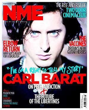
NME stands for New Musical Express and is a weekly magazine which has been running since March 1952. The current magazine costs £2.30 to purchase and has 66 pages. I am specifically looking and reviewing September 25th 2010 issues, which has on the front Carl Barat.


Starting off by looking at the magazine in general and the front cover I notice that NME magazine is about 1cm wider than most magazines, and seems a lot thinner. This week's front cover has Carl Barat on it, I personally don't like this cover very much. The colours are used well, the main ones being Red, Blue, White and Black but I think the image in the background is not very well edited. I think that the contrast is a bit off, and makes everything look out of focus. I think that NME want everything to be out of focus so you focus on the face of Carl Barat but I personally don't like this approach. I think the white boarder around the magazine does work well. If I had to take a tip from this front cover on how to do mine it would be to have the words in bright colours, Red is very good to use.


The Contents page I think works really well. It isn't a long list which gets boring it has different images spread out across the page, with the pages not in order (having page 1


2 on the right and 36 before it in the middle). I think the contents works well because it has a white background so the images stand out well and then all catch your eye to the big stories that NME want you to see. With the pictures go some quotes from each article and a small insight into it, which doesn't give too much away but gives you a taster to go and read on. I also like the fact that the rest of what is in the magazine is in a very small column with just their headlines, these seem to be weekly things. For NME it's a good way to make sure the reader goes on to look at these as they don't know what they are so will be intrigued to look at them. NME is also very crafty, as the only time Red is used on the page is to attract the audience to a subscription to the magazine. I like this contents page, it's rather simplistic but at the same time eye catching.


Through the pages there are a lot of adverts to help bulk the magazine out, these adverts are for music and fashion based at the type of reader who likes NME, these tend to be very Indie adverts.


The main article on Carl Barat I found to be rather boring. It had a lot of q


uotes from Carl but at the start I found it to be dull, I'm not a fan of The Libertines so this isn't really my kind of article but the first few paragraphs seemed to be more of an autograph than an interview. I would have expected an interview to be talking about the new solo album Carl is releasing in October but it starts out differently. The picture to the right I also didn't like due to the blur on the gun which actually made me feel a bit dizzy to look at. On the next double page spread there was a nice big timeline of Carl's work, I liekd this feature as it wasn't too deep but gave you snippets into his career, and kept you interested.


In general I didn't like this magazine very much, the paper itself felt more like a newspaper and I didn't really enjoy the other articles. I foudn the size of the magazine to be to wide for my liking. When I do my magazine I will try to base my contents page like there's without copying it, I will also make sure I use bright colours on my front colour for key words.


2/5 Rating


Picture's Source: http://www.nme.com/magazine

Friday, 24 September 2010

Third Magazine mock up for preliminary task - School Magazine


This is my attempt at my magazine cover, as of yet I have not put my own images onto the cover but I have edited the second attempt.

Different from the second attempt are the font types and I have changed one of the stories and images/shapes. With the shapes I have taken out the love heart with the story of Teacher Love as I felt this to be tacky in comparison with the rest of the magazine. I changed it for a softer picture of a timetable and changed my story to being about Timetable Much Ups. I kept the star in as it seems to be more in keeping with the tone, having only one shape means the magazine doesn't end up looking too tacky.

The font has now been changed from Times New Roman to Broadway, I did this because Times New Roman is very common and is not often used in magazines, Broadway is eye catching and I think it works well with my magazine as a whole.

For my final design I will be making the images my own and trying to get the layout correct for the final time, and tweeking out any mistakes that I find.