About Me

My photo
Jamie, that's my name. I'm a Norfolk meterosexual who likes women outside his own family.

Sunday 31 October 2010

Uprising on Facebook

I put my second concept idea for Uprising on Facebook.com to getsome feedback on people's thoughts who hadn't completed a questionnaire. I was pleased with the feedback, some posotive and some negative. I hope touse this feedback to help progress my front cover.

Classic Rock Front Cover Review

I am reviewing the front cover as you would see it if you were buying it in the shops. This means that the free Cd is still on the cover.

The large masthead is probably the first thing that catches your eye when you see the front cover. The R and K and bigger in proportion than the O and C which means it is a really eye catching word. This means it can easily attract people from the niche market of Rock music because it's in big bold letters at the top. The word Classic might be ahead of it in the name but the fact it is much smaller and almost perched in the top of the masthead means it's more extra information, to then add the edge that it's older Rock. Being called Classic Rock and having it in big letters it can appeal to the older generation, instead of current Rock bands like Shinedown you are looking at things like Black Sabbath or ZZ Top.

Just above the masthead is a small red bubble mentioning a free Cd. Free is in big capital white letters, people are often drawn into something if it is free so this is an important thing to have on the front.

The free Cd is risen off the page slightly so it immediately makes you grab that part of the magazine. The design on the album cover is important to keep in with the music theme else not it loses the design that the cover already tries to portray. Apart from black there are 3 main colours used on this cover, green, blue and red. These all are different from the colours on the rather simplistic main cover. They are eye catching because Classic Rock's selling point can often be the free gift. The colours work well together and with a picture of a skull being central and then green leaves round the outside it reminds you of death. The colours take away the sadness death usually holds with people and just makes you think of proper hard Rock 'n' Roll.

The main feature on the cover is unsual for a magazine as it doesn't contain a picture of any artist within the magazine. Instead it features a gold computerised symbol which is there to show the greatest 150 debut albums. Gold is a key colour because it often means; class, wealth or style, which goes hand in hand with being great or classic. The black behind the main focal point makes the gold stand out even more. The gloss effect of the cover also makes the gold shimmer in the light. This magazine cover tries to actually make itself seem classic and classy.

The only extra information is tucked away at the bottom, this means it doesn't affect any of the focal point on the main image but you still get left with the important information.

This cover is rather simple but contains everything you need to know without the cover become overloaded and looking too busy to read.


"Contents October 2010 Issue 150" - Classic Rock Contents Page Analysis


When you look at this page it is very bright colours and a vibrant picture of Ozzy Osbourne is very noticeable next to a white column filled with red and black text.

The picture is very vintage but it has vibrant colours and Ozzy's skin tone is very rosy pink which shows a lot of life in this picture. This portayal of life also goes well in connection he is 'living life' and at the same time giving himself a tattoo in the image. Ozzy has very open eyes and his jaw is wide open too, it really shows experience and makes the picture feel more alive than just being a vintage shot. There is a small caption at the right of the shot which talks about Ozzy's greatest album to date, this makes you want to read on and then discuss your own opinion compared to theirs. The image really sums up Classic Rock because Ozzy is often called the 'Godfather of Heavy Metal' but many recognise him with the Rock world so it is a perfect first image to use in the magazine to keep the audience interested.

The information for the contents is actually split into 2 pages, this contents page gives the details of the more key features that you will only find in this issue. There are 6 main chunks of texts that all give detail on what is in the main magazine with the numbers in red and then the title of the paragraph in bold black. The information isn't too necessary as the bold text can be enough for someone to then read on, but it gives you that extra bit of information you might wish to know.
At the bottom there is then a special mention for the cover story. It is already discussed up the top of the page but that feels more formal than this piece at the bottom. It seems more like a headline but within the contents page so even there, the front cover has an impact upon the audience.

"Greatest Debuts" - Classic Rock Double Page Spread Analysis


With this double page spread you notice that there is 3 main sections; a small column to the left with great debut albums, a Jimi Hendrix article and then an article on the album "Mr. Tambourine Man" by the Byrds.

Looking at the first column you notice that the background colour is a pale green with the album's name being in red and everything else in a black font. There are small pictures of the different album covers and then a small chunk of information on them. There are only 5 to the column which means it's not a long list and are small little bits of text to read away from the main articles. I think these work well because if you have just read an entire article you want some short text to break up the long haul of words so you don't get bored. The fonts work well to separate out the different bits of text, both the artist's name and the album name are in capitals so you can tell them apart. The album's name is in red as for this article it is more important. The other nice thing about these are that you can think, "Oh I had that album." This then makes you think about listening to the music mentioned so it really gets you thinking.

The middle chunk spreads out of both pages, the article being on the right page and an image of Jimi Hendrix on the left. The image is a black and white one but is very detailed. The entire image isn't shown but due to his fame and the small captions at the bottom it is easy to recognise who it is. The picture looks very innocent and an honest man. There is also half a vinyl disc at the bottom with a quote from Pete Townshend, this adds to the picture to back up how important Jimi Hendrix is. As there is a big image and a couple of quotes and notes surrounding the image you can already tell that Classic Rock believe this to be an important debut album as he has the majority of the double page spread.
You are caught to the text with a big capital B which is there to make sure you look at the article and don't skim past it. The text is in a long column but easily broke up into paragraphs, each adding to the one before it. The paragraphs detail a small history surrounding the time period that the album was released, the information isn't too in depth and gives you enough to be intrigued with the album. I think the style is good as it also includes some personal opinions from the writer but there's a good chunk of interesting history about the album and how it set Jimi Hendrix on the path to fame.

The last article has a pale green background like the first and a black and white image at the top. The album cover is shown to the right and immediately you pick up on the quote in the middle which is in a crimson font and also the 'Did you know?' bubble to the side of the page. These catch your eyes straight away so you go to read them and are immediately in the centre of the article and eager to read on.
The article's text starts like the Hendrix one with a big capital B to also catch attention but the article is slightly different. This one is set out like an interview but without any questions, instead the interview tells the story and then after bits of speech there are small bits of history which don't over analyse the text which has gone before it.

I think this is a good double page spread because of the colours, the 2 pale green pieces don't look fixed to the page so it doesn't seem to bogged down, and if you could imagine it as reality the page would be light and airy. There might be a lot of text but the spacing out and colours don't make it a daunting task to read it all.

NME Front Cover Analysis


This cover seems to have a lot going on when you look at it, the front cover seems busy with a mixture of coloured fonts, a masthead and a sadistic looking man in the background.

The fonts and colours stand out a lot on this front cover, a use of Red, Light Blue and White stand out well against the dark background. These colours are quite innocent, with the line reading; "I've got a right to tell my story" as though this person has been silenced for a period of time. A main use of the colours on this cover would be to really catch your eye. The words Carl Barat are in big capital letters and have a light shadow behind them. This helps to bring the letters out into the foreground more and show that NME have an important interview inside. These 2 words also stretch across the entire page meaning they are very hard to miss. The text seems very unorganised and different things are thrust across the page with fonts that don't seem to keep in any type of pattern. Bits of the stories at the side cover Carl Barât's hair which also makes the cover seem messy.

The image behind the text is very bold, you are drawn into Carl Barât's face immediately and especially his eyes which seem to have an angry glazed look on them. The background of the image is fazed out and so too is his jumper and neck, with his face being the only part of the picture not distorted in some way. His skin tone is very dull which helps draw you into his blue eyes which are in some ways mesmorising. The fact the eyes are at eye level when you look at the magazine could have a sort of hypnotic effect where you then want to have a look and see what is in this issue. Or this is what NME hope for, the cover is overloaded with text and a blurry picture which distorts your eyes. The cover might draw you in but when you actually try to look at the information it is rather hard to concentrate on one specific area as there is so much on the cover.

I personally don't really like this cover as I find it is very jammed with information and if it was a bit simpler would be more effective at making me want to read inside. The cover might have eyes that draw you in but the surroundings are too full with text which makes the cover seem overloaded.

"Inside This Week" 25/09/2010 - NME Contents Analysis


When you look straight away at the contents page you notice that there are many different colours and these all come from sperate images on the contents page. The images are all the same size except one image which is noticeably larger which is because it is a main story in the magazine, this is good for NME because what they want to be key focus of the reader's time can be because they have a large image publiscing it. Everything is noticeably spread out and incomplete boxes help to also seperate stories so nothing is overlapping or too confusing to the reader. This is a good method to use because it means you know which picture relates to which piece of text.

The text itself is split up with different fonts that relate to the pictures on the contents page. They all have their very own quote with them and then the quote is in a more stand out font that the writing below which gives extra information about the article that the image relates to. The quotes give the audience a small isnite into the kind of article it will probably be, about how the artist talks and what kind of artist it is that NME are chatting to.

A feature I really like from this contents page is the fact there is no numerical order to the contents, NME order the images to their importance, then put their page number in a white box in the bottom right handside. This makes the contents feel more open and less like a list, meaning there is more chance you will read it, thereby making sure you read more articles.

In a small gap in the bottom is a very small column labelled, 'Plus' which contains a maximum of 3 words per line and a page number relating to it. This is because this is regular stuff to magazine, this is helpful to save space and it also reduces any kind of long list you oftenly see in a contents page.

On and ending note NME manage to sneak in a cheeky little advert for themselves in the bottom right corner. The background colour of this is red, which is a very eyecatchign colour meaning people will more than likely look at this after looking at the images. The writing is large and white so it stands out. The slogan reads; "WANT TO GET NME FOR THE BEST PRICE POSSIBLE?" This is brilliant way to advertise as people start to think of money they will be saving on this £2.30 magazine. Then in much smaller font it offers a subscribtion. I think the advert in the corner is very well done because when a magazine has a subscription on an entire page you often skim past it if you aren't interested.

"Carl Takes Aim" - NME Double Page Spread Analysis


As soon as you look at this double page spread you are straight away drawn into the larger than life picture of Carl Barât holding a gun. This picture really sets the tone for the double page spread on offer, something trying to be rebelious and edgey.

The picture of Carl Barât is taken at such an angle that the gun is distorted and you immediately catch hold of a set of demonic and possesive eyes just behind the gun. The picture is also accompanied by a small quote, which without reading the rest of the article you have to presume comes from Carl Barât. The quote reads; "IT WOULDN'T WORK IF THERE WEREN'T FRICTIONS - IT'S THE FUCKING LIBERTINES". This quote helps to back up the image NME are trying to portray with the image of Carl Barât being all rebelious and a bit of an anarchist. Even in writing "fucking" is still pretty strong language that shows to the reader that this guy has some attitude.
The colours of the picture are rather bland, the black on the leather jacket Carl wheres isn't a dark black so it makes the whole picture seemed very chilled out, and Barât kind of looks like he is on drugs. White often means purity and though there is a cream in this picture it works in a total irony of the fact he is carrying a pistol in a gangster style way. The picture is really quite important for the double page spread and relating articles as it gives you an idea of the kind of man Carl Barât is even if you don't know anything about him.

The opposite page has over half the page taken up with a massive title that just says; "CARL TAKES AIM". This obviousley has more meaning to the fact that Carl Barât has a gun in the picture opposite but relates to the fact he has just completed a solo album.
Before reading into the article there is a sub-headline which gives a small bit of detail about what the article will be about. Then you notice 2 capital letters, a W and a T which show the start of new paragraphs or a lead on in the story of Carl Barât. I think these are good because it helps to break up the article meaning people won't feel too sufficated with the length of the article.

When you get into the actual article is starts in the middle of a story that Carl Barât is telling. I find the article to be rather dull as after Carl says something there seems to be a narational piece where it is then described about what Carl's just said. I find this to be rather boring as there aren't really questions asked it's just someone putting everything into an explanatory list which is disguised within a paragraph.

I like the picture idea, though the actual picture I would have differently but I don't think the article is that great.

Music Magazine Questionnaire

When I was thinking about my music magazine I decided it was a good idea to do a questionnaire. To start off with some basic thoughts from people I used a sample of 10 teenagers to fill in my first attempt at a questionnaire as to gain some knowledge on people's thoughts about music magazines.

My first question was about people's age, I wanted to find out the age of the people I was asking, 80% were 16 or over which was my ideal age range, with 1 person being 11 or 12 and one other being 15. It was good to ask people 15, 16 and over as my magazine is very much a teenage aimed magazine. One person asked was not a teenager, this is good also as it means that I can find out opinions from other age ranges.

My second question was really about music genres, I feel my magazine is a very much aimed at a the market of Rock, Alternative or even Metal so it is important many people like this. As you can see from the bar graph only 3 people weren't big fans of these 3
genres.

Questions 3 and 4 were very much linked, as question3 asked about how often people read music magazines. Of the people asked a poor 60% said they never read music magazines which then gave limited answers to question 4.

I feel question 4 was too open as it askde what music magazines people read, there were a wide variety. What I could see though was that people that liked the Metal genre read magazines relating to that market and same with people who read Pop magazines.

Question 5 was an important question as it asked about what attracted people to music magazines. The cover and the articles were the 2 most selected things people purchased a music magazine for. The other things people looked at were price and prizes.
I think that this question will be a big help in how I sculpt my music magazien as it shows that most people look for these 2 things to be good quality in a music magazine.

Question 6 wasn't too important for me with my cover as I won't actually be selling my magazine but I want it to be as authentic as possible, so having a price people like to pay adds to the look of the magazine. Most people said £1 to £2.99 was ok, at the moment my magazine is priced at £3.99 so I might decide to bring the price of this down.

Question 7 is very much like question 5, it asked what peoples' favourite part of a music magazine was. Most people said either the articles, cover or free gift. This again backs up the fact I have to write the articles well and put a lot of attention into the front cover.

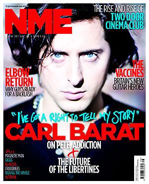
With Question 8 I had a selection of 4 covers; Classic Rock, Metal Hammer, NME and then my Uprising and asked people their favourite with question 9 asking reasons for this.
The equal winner for the most preferred covers were Classic Rock and Uprising. Reasons were that these covers were not overpacked and that the colours worked well.

For my final question I asked people to say what they would change about my cover, Uprising. Some people said to slightly enhance the colours on it and change the font type and size for some bits.

I think these answers can be quite helpful as I know what to base my magazine ideas around and try hard to think about what is important in a music magazine.

Friday 29 October 2010

Music Magazine, Front Cover 1st Attempt

I think my first attempt keeps to my layout quite a bit, I have made sure that I have kept to the layout. Looking at my magazine I can easily say that it is rather unconventional compared to normal magazines.

The masthead acts as a logo as well as a normal magazine title. I used the font HARD ROCK which I downloaded from www.dafont.com. I think the title works really well as it makes the magazine look grungy which is good for a rock magazine. The title is rather large which means that it is very eye-catching. I used a dark blue tint behind the lettering so it stands out well and it often signifies calm things, and that is what the colour does. It helps to reinforce the sea, which is in the background but is in black and white.

The puff at the bottom is also written in HARD ROCK but I think I will substitute this for the font, Fucked Plate. I think the fonts I use are important as they need to show anarchy because this is a rock magazine. I want to substitute the font at the bottom because I think that it is quite hard to understand.

The main image is of someone standing with his back to the camera and arms out. This is unconventional for a music magazine as usually the artist is facing the audience, but having him facing away means the reader will want to go on and read to find out more because they know limited information about the artist. Also the pose he is in is reminiscent of Jesus, so it makes him seem very important. An important feature to note is that the artist is on top of a cliff facing out to the sea, it signifies coming out to the world and showing that he is here and important. He is high up when on the cliff so it shows power and importance. The green around his feet is there to show new life, green often symbolises this and this is a new artist so it shows that he is important and new.

The stories to the side of the main image I think work well as they fit around the image, I think I will edit the stories as some of them would be better for being different entirely. The font I am using for those at the moment is quite standard so I am going to change that for a different font which would work well for my niche market of rock music.

If I had to say 2 things I liked about my magazine it would be the main image as it's different so it would be more noticeable if in the shops. Another feature I like is the title, I think the downloaded font works really well to show what type of music genre this magazine is aimed at.

A couple of things I think I could improve upon would be the font at the bottom, to make it easier to understand but keep in mind the grungy look I am going for with the front cover. I would also change the shading of the black and white behind, I think I want to change the contrasts on the image just to make sure I get the perfect colours.

I like my magazine cover but will be expanding on it some more.

Tuesday 19 October 2010

Music Magazine, Front Cover Basic Layout


This is my basic layout for my Music Magazine.

I have very much sectioned things out and have tried to keep things simple with a simple layout. I don't want everything too overlapping so have kept it at this stage very block layout, though in my magazine it won't all be in squares of information.

The Masthead is one of the most important features to do, it has to be very eye catching and I want mine to be a mix between a logo and a Masthead, so when people see this Masthead they recognise the fact that it relates to my magazine.

Under my Masthead I want a title for my magazine, this will relate to the main image I choose on the front of my magazine cover. I might decide to substitute the headline for a puff at the bottom of the page that gives extra detail about my magazine or put what my image relates to in a piece of text to the side of the image so people then have to buy and ultimately read the magazine to find out what it means.

My image is in the center of my magazine, this is because I want it to be the focus of my cover and to show that whoever is on the cover is quite important. I haven't decided on an image yet but I have a few ideas.

The text on the front cover will relate to what is in the magazine, there will be small amounts of information so that the readers want to read on to find out other stories.

For the moment I plan to have the barcode at the top right corner near the Masthead but think that I will move this to the bottom because the barcode is not at all an attractive item on the cover and the sole purpose of the cover is to attract the audience into buying your magazine over another one.

In the next week or so I plan to expand on my front cover with a few different ideas before deciding on a final one. This could include a change in image used and stories.

Wednesday 13 October 2010

Magazine Name

I just don't want it stolen so I'm Blogging it! UPRISING! A magazine for new artists breaking through the ranks!

Tuesday 5 October 2010

OMG EMI, Bad Day at the office

http://www.thisislondon.co.uk/standard/article-23884534-bad-day-blur-photographer-sues-emi-after-cleaners-bin-archive-collection.do

Write piece on this

Monday 4 October 2010

School Magazine Cover Finished


This is my final version of my school magazine cover. It has changed since my original concepts quite drastically, each atttempt I have done I have made it look more like a magazine at each stage and that is why each change seems so diffrent to the last. With this cover I did it all on Adobe Photoshop which means that the clarity of the cover is much better than before.

There were many stages to my magazine cover, I started off by taking a high angled mid shot of a student outside the front of the school. I then took this image to Photoshop and made it black and white. I wanted both the student and the school to be key things on the front cover so then copied the colour from the original image so the image appeared to be layered and these things then stood out from the page more effectively.

I imported my logo onto the cover as this was a key feature for my magazine, and because this in itself is eye catching I put it next to my masthead in the top left corner. I then put a stroke around it in the colour white, with a 7 point thickness, so that is stood out against the background and was legible.

The text on my cover was done in 2 fonts, Cooper Std and Marker Felt. The different parts of the cover were done in different font sizes depending on how important the text was. I wanted the text colours to be blue then red every other word to follow suit with the school colours, but this was hard to read against the red colour of the school door, so to sort this problem out I put strokes of white around the words as well as my logo. I used different size strokes to corispond with size of the text, the smaller the font size the smaller the stroke.

Some things that I have done in my school magazine I can help use for my music magazine, in my music magazine I will also have colour main images upon a black and white background to help focus the audience's attention. I will also consider using stroke around the text on my page so I can easily see the text and lastly will also use a big logo for my music magazine so I can cathc people's attention wuickly and easily.

Another post will appear showing ste by step account of how I created my front cover.


The Presidential Pod


With music downloading very big across the globe it's only right to find out that United States President Barack Obama has his own iPod and there are a few key artists dominating it.

Obama said that he used to have American rapper Jay-Z on his iPod until recently. Jay-Z is a multi award winning artist signed to Roc Nation, a music production Jay-Z helped come up with alongside its parent company, Live Nation. Though now Jay-Z doesn't dominate the Nobel Peace prize winning President's iPod.

Instead Obama likes to listen to a bit of Nas and Lil Wayne and is starting to get his daughters into his music taste, he said it's nice to see them 'hipping to things'.

Nas is an American rapper signed to Columbia Records, a part of Sony Entertainment, he has ironically had a feud with Jay-Z, someone who Obama has kicekd off his iPod on favour of Nas.

Lil Wayne is a Grammy Award winning American rapper who is signed to Young Money music label, Obama said that his "rap palette had greatly improved". With Barack Obama saying whose on his iPod is it only a matter of time before David Cameron admits to having Wham, Elton John and Chico on his iPod?

Source: http://www.bbc.co.uk/newsbeat/11434229
Picture Source: http://www.crunchgear.com/wp-content/uploads/2008/12/4obama20final20ipod20copy_2.jpg

Friday 1 October 2010

Contents Page Mock Up for School Magazine


This is the mock up for my contents page of my school magazine. On it I have included all the usual things you expect to see on a contents page such as the page numbers and details of articles but I have also taken ideas from other magazines such as NME.

In NME I noted that they had a cheeky advertising space for themselves, so in my contents page I have put a space for an advert, this advert would be appropriate for a school magazine so I would probably put an advert from something around the school, like I could advertise a school disco or event that I wanted to help raise money. This could be one way of making mass market and also using a cross media technique because I could incorporate maybe something musical around the school which is happening.

I have a list in the middle of the page for the main articles that I want to print, things that don't often occur in my magazine, such as a key article like a fire. Then for things that appear regularly in my school magazine I will have them in a small box of extra things in the top corner. I will then have images to show the kind of things in my articles. The colours will be red writing on a white background so it's simple and eye-catching.