About Me

My photo
Jamie, that's my name. I'm a Norfolk meterosexual who likes women outside his own family.
Showing posts with label Creating. Show all posts

Saturday, 26 November 2011

Music for my Trailer

The music in my trailer is a combination of sound effects from iMovie HD and the music that I made myself using Garageband software.

The list of sound effects I used are:
  • Foreboding
  • Scary Accent
  • Heartbeat
  • Suspense
  • Cold Wind
On iMovie I also recorded my voiceovers for my characters. This took several attempts to get right, but once I had got the voices correct I moved them to the right positions with ease.

Garageband

Using loops
on Garageband I managed to make my soundtrack for my trailer. I used many instruments and had them at different volume levels to get the desired gothic, supernatural effect. I had the grand piano and acoustic base as my 2 loudest instruments. This helped create my repetitive spooky tune. I wanted to make it the same throughout my trailer to show that there was always a ghostly presence. By cutting the loops to the bit of sound I wanted I then dragged them back out to get a flowing sound.


The Watching Original Soundtrack by MiniManJamJam

The Watching Final Music by MiniManJamJam

Wednesday, 28 September 2011

The Watching Poster

This is my final poster for the film of my trailer.

After creating the step 9 poster I put that on my Facebook page in order to gain peoples' opinion of my work. Many came back saying they liked the poster but that there were things they felt would be better off changed. I used the audience feedback to edit my poster.

Before my poster had a very boring ident, it was just the text saying 'After Burner' but now it is changed to a blue and purple pill shape with my new production name 'Read Studios' within it. I prefer this ident as it stands out from the page better, and is easily transferable to other media products that I create.

Another change to my poster is the girl. Before she was fully visible with a drop shadow which was there in order to show she had depth. Now the girl has a black colour overlay. I think this really works for my poster, you know very little about her there, just the impression that she is planning something and watching the male - this thanks to the tagline and film name. Her black figure can be seen pressing up to the window and isn't immediately visible. The fact it isn't immediately noticed means people have to get closer and look to see what it is, thereby attracted to the poster to see what the unknown is.

Lastly from step 9 I made my title larger so it took up most of the top of the page. I originally didn't want the title so big but had problems getting the title central due to the size of the words 'the' and 'watching'.

I am impressed with this final version of my poster.

Monday, 26 September 2011

Creation of my poster - Step 9

This is how my poster looks after all the layers come together. I am pleased with it but intend to put it on Facebook to get some feedback from my peers in order to see if there could be any improvements made to it and anything that is wrong.

I intend to change my poster accordingly to the feedback if I feel it is worthy of change. I will write another post about feedback to show the criticsms and then show the improvements.

Creation of my poster - Step 8

For the next stage in creating my postersI had to add the text layers tomy poster. Getting the text layers right is very important as it gives away little bits of information that help the audience get attracted to this poster. With the 2 pictures there is only 1 major difference, the actor's names.
The actors names are only on 1 of the posters as I wanted to compare the differences between them. The reason for the actor's names not being on both posters here is due to the fact that I felt putting them on the poster overcrowded the text layers and that there might be too much text for the poser. This is something that I will use feedback to decide on.

With the other pieces of text I have only used 3 fonts which I downloaded from abstractfonts.com and dafont.com. The 3 fonts that I used are:
  1. Reprise Stamp - The Watching
  2. I Still Know - Patience is a Virtue
  3. Steel Tongs - All other text.
'The Reprise Stamp' font I chose because it looks good in all capital letters and catches the attention of the audiences. The text looks slightly supernatural and appears a bit spooky. Adding glow affects also means it looks paranormal.
'I Still Know' again looks good in capital letters, it looks quite an old font so that means it can appear kind of gothic. Due to the mystical themes within my trailer a spooky font is important. It suits the words of my tagline which is important.
'Steel Tongs' is a very important font. Using lower case letters turns the lower case letters into movie credits, such as : is the word, Presents. To have the actual word you type in this font it must be all in captials. The font is very proffesional for a movie poster and helps my poster keep to the normal conventions of a movie poster.

Creation of my poster - Step 7

Step 7 involved me creating the main supernatural character, the dead ghost. I decided that my character should be positioned behind the glass of the shelter because the male of the poster could not see her, but the audience could. The title of my film is "The Watching" and obviously this character appears to be watching the man. The tagline of "Patience is a virtue" also hints that she has time and is going to get revenge and it doesn't matter how long it takes.

The girl is wearing normal clothes but they are just plain black, the reason she is in these clothes is because she died a normal death, in the movie trailer I will make sure she is in this outfit at least once. Both costumes the characters in the posters wear will be used in the trailer in order to keep continuity.

There is a backdrop on the girl to try and make her seem more realistic. My audience feedback may suggest this isn't so good, so for my final version the backdrop might disappear.

Creation of my poster - Step 6

In this step I added on my main male character. I had the actor looking down because he is guilty for what he has done. This could lead the audience into wondering what he has done and maybe feeling sorry for him. This is in contrast to what I intend to do with my trailer, in my trailer the male character will try to divert any sympathetic feelings people might feel for him.

The clothes in this poster are very natural. The character is in no way supernatural so is wearing normal clothes. He is wearing a blazer with a tee shirt, this is smart casual, the look that I want this character to have. The jeans and trainers that he wears are also very casual. In some ways his clothes don't conform to the norm, other movies with the same type of character usually wear smarter clothes. I want my character to try to appear younger than he is as his character profile shows him to be manipulative in this way.

Creation of my poster - Step 5

The next thing I did was to add to the supernatural effect that I was craving for my poster. I started by creating a new layer, then I added a layer mask to the layer. To then create a new desired effect I went to filter and render and used clouds again. To makethe clouds have more contrast and better defined edges I also used defined edges. I then used blending options to make it into an overlay layer.

I also made a purple gradient on another new layer, this I also changed into an overlay blending option. Having both of these as my highest layers meant that they went over all the other layers that I had meaning everything below these layers would appear supernatural.


Creation of my poster - Step 4

With this step I created a new layer and slotted it inbetween the 2 layer
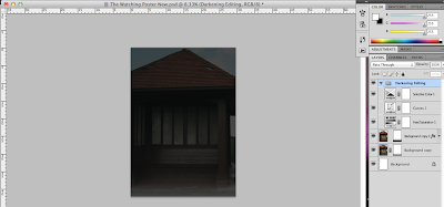
s of the shelter that I have. I then made sure on the higher layered shelter that I had eliminated the skyline as it was too bright.

Then using the clouds tool, in Filter then Render, I created some darker clouds that looked more like a stormy day. This was a simple but effective thing to do.

Creation of my poster - Step 3

I wanted to make the entire poster a lot darker so I decided so edit other main things in the poster.

I edited; Selective colour, Curves and Hue/Saturation.

For Hue/Saturation I left the Hue at 0% and had saturation at -54. This made my image look quite grey and dull, which was the intended effect.

Next I edited the curves. To make sure that I had a very dark image I kept the curves of the line very low and straight so that there wasn't too much colour or contrast with the image.

Lastly I added a Selective Colour Adjustment Layer. I used the drop down menu and selected the colour Black. Changing the methor to relative I edited the following.

  • Cyan: +1%
  • Magenta: 0%
  • Yellow: 0%
  • Black: -4%
The image in the screen shot is what all of this editing created.

Creation of my poster - Step 2

With my original picture before editing the colour to make it look darker and more supernatural I decided that I should make there seem a little bit foggy as fog is often associated with supernatural and gothic themes. On a duplicated copy of my picture I added a vector mask and with black and white as foreground and background colours respectively, I used the gradient tool to create a thin fog effect at the base of my picture.

Creation of my poster - Step 1

The first step of creating my poster was to get the picture that I would be using. The picture that I used I got on Old Hunstanton cliff top. I took a picture of one of the shelters there as I felt it to be an ideal spot for both my trailer and my psoter.

Poster Template 3

The main difference with this layout is that I have included the text for my tagline that I think I will use. Everything else is in relatively the same place that I planned it to be.

When I come to create my poster I migth change a few things around to see the difference and what works better with my actual images.

Poster Template 2

For my second template I decided that I should inlude the title name, actors' names and my tagline. The text for this layout is still basic as I hadn't made final choices on my fonts for my poster. I still want my image to be over the poster but the focal point to be directly in the middle and eye line.

I still want the title to be very focal to the audience. I want the font I use to compliment my title and also my genre.

Looking at many other movie posters I conform with the norm by having a central image, information at the bottom and the title at the top.

Poster Template 1

This is how I wanted my poster to look originally. I used simple text just to outlay where I wanted everything on my poster. I wanted my image to be over the poster but the focal point to be directly in the middle and eye line.

I want the title to also be very obvious to the audience, for this layout I have not included any names for my movie as at this stage I want to learn the layout.

Looking at many other movie posters I conform with the norm by having a central image, information at the bottom and the title at the top.

Wednesday, 10 November 2010

Front Cover Images

I have now decided on the 2 images I wish to use for the front cover of my music magazine; Uprising. This includes the main image of a music artist and also the background image on the front cover.


The image of the artist I chose to use because it is mainly different. In the shops a lot of magazines have the same idea when it comes to the cover, an artist facing the front and taking up the entire page, but this image is more unconventional. The artist to start with isn't facing the camera so that means you don't know who it is, so it can make you want to read on and find out who it is. The way he is positioned, with his arm out in a cross ca

n denote a religious figure, which then putting him on the cliff top can make it seem like he has been sent by God. The clothes the artist is in are very normal because he's just a normal guy who made something for himself, this way it relates to the audience showing that anyone can make it in life.


The background image I chose to use is from Hunstanton Cliffs. I felt that the cliffs are good to use because of their positioning and what they can connote. The view from

the cliffs appears to be endless which could give someone the idea that the artist's music won't end. The cliffs are also up high and near the sea so positioning the artist on the edge of the cliffs, meaning the height adds a meaning of power and also with the sea makes it seem like he is coming out to the world about how good his music is.


I think combining these 2 images works well because the position helps compliment the cliff edge, together it makes it seem like he could possibly have been put there by God because of the cliffs and the sea seeming endless.


In later images used on my front cover the artist has been levelled out in Photoshop and the cliffs have been zoomed in on one specific area and turned to black and white.