
About Me

- Jamie Read 2010
- Jamie, that's my name. I'm a Norfolk meterosexual who likes women outside his own family.
Showing posts with label Front Cover. Show all posts
Showing posts with label Front Cover. Show all posts
Friday, 11 November 2011
Thursday, 10 November 2011
Thursday, 27 October 2011


Thursday, 15 September 2011
My Storyboard
 In this storyboard it shows how my story for my trailer occurs. This storyboard shows the story in a chronological order but for my actual trailer it's going to be different. I wanted to get my ideas down for what I wanted to do. The storyboard is thumbnail type and this was important as I wanted my plot down on paper before I forgot it.
The drawings are very rough which is ok for this starter storyboard. When I come to do my actual trailer I will change the order of everything so that it attracts the audience.
After thinking about my plot I decided to do this tumbnail storyboard so I can think more in depth about what I will do for my poster and magazine cover.
Tuesday, 6 September 2011
Location Shots
 These are the location shots for where I want the main part of my trailer to be shot. The glass behind the bench I want the dead girl's ghost to appear looking pasty and ghastly. On the bench I want her killer to be sitting, as the ghost of the girl sets her sights on revenge.
My Moodboard
 This is my moodboard. The things on my moodboard include specific places I wish to use in filming, things I want to be in my trailer and things that I think would be a good idea for my trailer.
I created this moodboard on Adobe Photoshop and collected the images from the internet. I decided to create a moddboard for my trailer before the production of my poster because I wanted to get an idea of what I would use in the trailer, so I had ideas of what to put in for my poster. In order to conform with current film posters using the same location in both my trailer and my poster are important. It is a way of keeping continuity throughout my media creations.
The pictures of the hut, cliffs and church are exact locations I intend to use in the filming of my trailer. The gravestones and trees with fog are not settings I will actully use but ideas for settings and weather.
The face and the girl are not characters I intend to use, but moulds of characters. The man crying is one idea I have, a way to show my main male character as feel guilty for what he has done. The girl is a ghost, she is cut from the movie, "The Shining" and on Photoshop I have made her more opaque so she appeared more like a ghost. I might use this technique in my poster to show the girl as being a ghost.
Sunday, 5 December 2010


Sunday, 21 November 2010
Music Magazine, Front Cover 3rd Attempt
From my first attempt I have not changed the front cover too much. I have kept the image as it was though editing the colour slightly by levelling it as it had a red filt er over it which came from the camera I had used.
er over it which came from the camera I had used.I have mainly changed the stories on the front of my magazine cover and the positions of them to try to make things seem more set out. Stories on the right hand side are aligned to the right where the left hand side is aligned to the left. I removed one story on the cover about the artist in the picture and substituted it for a headline above the masthead. This is in the center of the magazine and is eye catching. It is like the iamge and is only a teaser as you don't know much about the artist in the picture from the front cover.
With the image I put a glow around the artist. This is because a glow is often associated with an angel and the artist has his arms out like a religious figure so adding the glow makes him seem like a 'saviour' and also makes the audience know he is important. I have also added a shadown to the bottom of the artist to make the image seem less photoshopped than it orignally appeared before. There is only a small amount of grass around the artist and it is hardly sprouting up, this simplises new life and a new beginning for the artist.
I have kept the masthead font as Hard Rock but have changed the font at the bottom to Fucked Plate. Both of these fonts are inkeeping with the cover and also the hard rock theme of the magazine. The stroke around the Fucked Plate font is blue and it is hard to make out in comparison to the other fonts. I wanted it to remain blue because the image is on a cliff near the sea so the blue defines the sea of Norfolk. It also means people spend longer looking at the font trying to work out what it says, meaning they take an interest in your magazine and there could be a higher chance of them buying it.
Compared to my other attempt the difference with this one is that the artist is more central on the cover. In comparison with the new headline he is pretty mcuh in alignment which means your eyes are drawn in to both the artist and the headline.
Music Magazine, Front Cover 2nd Attempt
From my first attempt I have not changed the front cover too much. I have kept the image as it was though editing the colour slightly by levelling it as it had a red filter over it which came from the camera I had used.
have kept the image as it was though editing the colour slightly by levelling it as it had a red filter over it which came from the camera I had used. I have mainly changed the stories on the front of my magazine cover and the positions of them to try to make things seem more set out. Stories on the right hand side are aligned to the right where the left hand side is aligned to the left. I removed one story on the cover about the artist in the picture and substituted it for a headline above the masthead. This is in the center of the magazine and is eye catching. It is like the iamge and is only a teaser as you don't know much about the artist in the picture from the front cover.
With the image I put a glow around the artist. This is because a glow is often associated with an angel and the artist has his arms out like a religious figure so adding the glow makes him seem like a 'saviour' and also makes the audience know he is important. I have also added a shadown to the bottom of the artist to make the image seem less photoshopped than it orignally appeared before. There is only a small amount of grass around the artist and it is hardly sprouting up, this simplises new life and a new beginning for the artist.
I have kept the masthead font as 'Hard Rock' but have changed the font at the bottom to 'Fucked Plate'. Both of these fonts are inkeeping with the cover and also the hard rock theme of the magazine. The stroke around the 'Fucked Plate' font is blue and it is hard to make out in comparison to the other fonts. I wanted it to remain blue because the image is on a cliff near the sea so the blue defines the sea of Norfolk. It also means people spend longer looking at the font trying to work out what it says, meaning they take an interest in your magazine and there could be a higher chance of them buying it.
Compared to my other attempt the difference with this one is that the artist is less centered. He is more to the left, how he was on the original cover.
Wednesday, 10 November 2010
Front Cover Images
 I have now decided on the 2 images I wish to use for the front cover of my music magazine; Uprising. This includes the main image of a music artist and also the background image on the front cover.
 The image of the artist I chose to use because it is mainly different. In the shops a lot of magazines have the same idea when it comes to the cover, an artist facing the front and taking up the entire page, but this image is more unconventional. The artist to start with isn't facing the camera so that means you don't know who it is, so it can make you want to read on and find out who it is. The way he is positioned, with his arm out in a cross ca
n denote a religious figure, which then putting him on the cliff top can make it seem like he has been sent by God. The clothes the artist is in are very normal because he's just a normal guy who made something for himself, this way it relates to the audience showing that anyone can make it in life.
The background image I chose to use is from Hunstanton Cliffs. I felt that the cliffs are good to use because of their positioning and what they can connote. The view from

the cliffs appears to be endless which could give someone the idea that the artist's music won't end. The cliffs are also up high and near the sea so positioning the artist on the edge of the cliffs, meaning the height adds a meaning of power and also with the sea makes it seem like he is coming out to the world about how good his music is.
I think combining these 2 images works well because the position helps compliment the cliff edge, together it makes it seem like he could possibly have been put there by God because of the cliffs and the sea seeming endless.
In later images used on my front cover the artist has been levelled out in Photoshop and the cliffs have been zoomed in on one specific area and turned to black and white.
Sunday, 26 September 2010
NME Review
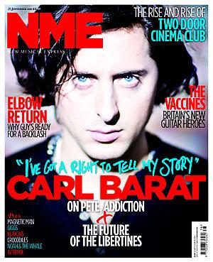
NME stands for New Musical Express and is a weekly magazine which has been running since March 1952. The current magazine costs £2.30 to purchase and has 66 pages. I am specifically looking and reviewing September 25th 2010 issues, which has on the front Carl Barat.
Starting off by looking at the magazine in general and the front cover I notice that NME magazine is about 1cm wider than most magazines, and seems a lot thinner. This week's front cover has Carl Barat on it, I personally don't like this cover very much. The colours are used well, the main ones being Red, Blue, White and Black but I think the image in the background is not very well edited. I think that the contrast is a bit off, and makes everything look out of focus. I think that NME want everything to be out of focus so you focus on the face of Carl Barat but I personally don't like this approach. I think the white boarder around the magazine does work well. If I had to take a tip from this front cover on how to do mine it would be to have the words in bright colours, Red is very good to use.
The Contents page I think works really well. It isn't a long list which gets boring it has different images spread out across the page, with the pages not in order (having page 1
2 on the right and 36 before it in the middle). I think the contents works well because it has a white background so the images stand out well and then all catch your eye to the big stories that NME want you to see. With the pictures go some quotes from each article and a small insight into it, which doesn't give too much away but gives you a taster to go and read on. I also like the fact that the rest of what is in the magazine is in a very small column with just their headlines, these seem to be weekly things. For NME it's a good way to make sure the reader goes on to look at these as they don't know what they are so will be intrigued to look at them. NME is also very crafty, as the only time Red is used on the page is to attract the audience to a subscription to the magazine. I like this contents page, it's rather simplistic but at the same time eye catching.
Through the pages there are a lot of adverts to help bulk the magazine out, these adverts are for music and fashion based at the type of reader who likes NME, these tend to be very Indie adverts.
The main article on Carl Barat I found to be rather boring. It had a lot of q

uotes from Carl but at the start I found it to be dull, I'm not a fan of The Libertines so this isn't really my kind of article but the first few paragraphs seemed to be more of an autograph than an interview. I would have expected an interview to be talking about the new solo album Carl is releasing in October but it starts out differently. The picture to the right I also didn't like due to the blur on the gun which actually made me feel a bit dizzy to look at. On the next double page spread there was a nice big timeline of Carl's work, I liekd this feature as it wasn't too deep but gave you snippets into his career, and kept you interested.
In general I didn't like this magazine very much, the paper itself felt more like a newspaper and I didn't really enjoy the other articles. I foudn the size of the magazine to be to wide for my liking. When I do my magazine I will try to base my contents page like there's without copying it, I will also make sure I use bright colours on my front colour for key words.
2/5 Rating
Picture's Source: http://www.nme.com/magazine
Monday, 20 September 2010
Second Magazine mock up for preliminary task - School Magazine
This is my second attempt at my school magazine cover. From my last magazine cover I have tried to steer away from the title page looking more like a magazine cover th an newspaper. I have used my created logo to work well with the mast head.
The fonts I used I felt worked well again with a school theme, I cut them down from 3 and now use 2 font types, Times New Roman and Tekton Ext. I thinks this are a good association of school writing. For my background I have decided to use a picture of the school, like this picture on my mock up magazine I wish to edit it so it is black and white, that means that my words and images will stand out from the cover better and attract the audience.
I haven't tried to go over the top with the colours, I have the colours from my images (these are mock images) but my main colour scheme would be red and royal blue to work with the old Smithdon polo shirt colours. Then have black and white so it makes everything seem quite simple but effective.
I have used different shapes to also attract the attention of the audience, a few stars and a love heart work well as they are big recognisable shapes. As a final way of attracting the reader I have included a free ruler with the purchase of this magazine.
In an attempt to improve my magazine I think I will get rid of a bit of the stuff off the front cover as at the moment it seems a bit overloaded and a simpler design could be just as effective if not more.
 an newspaper. I have used my created logo to work well with the mast head.
The fonts I used I felt worked well again with a school theme, I cut them down from 3 and now use 2 font types, Times New Roman and Tekton Ext. I thinks this are a good association of school writing. For my background I have decided to use a picture of the school, like this picture on my mock up magazine I wish to edit it so it is black and white, that means that my words and images will stand out from the cover better and attract the audience.
I haven't tried to go over the top with the colours, I have the colours from my images (these are mock images) but my main colour scheme would be red and royal blue to work with the old Smithdon polo shirt colours. Then have black and white so it makes everything seem quite simple but effective.
I have used different shapes to also attract the attention of the audience, a few stars and a love heart work well as they are big recognisable shapes. As a final way of attracting the reader I have included a free ruler with the purchase of this magazine.
In an attempt to improve my magazine I think I will get rid of a bit of the stuff off the front cover as at the moment it seems a bit overloaded and a simpler design could be just as effective if not more.
Tuesday, 7 September 2010
First attempt at the layout for school magazine front cover

This is my first attempt at the front cover for my school magazine. I have incoraparated codes and conventions such as the Mast Head, news, information, barcode and more. I have used the main shapes I wish to use when I make my front cover, these include the shapes of the text I wish to use, the shapes of the images I wish to use and the star shape to attract attention for a school competition.
In my first layout I have thought about 3 main fonts I wish to use; Mistral, Stencil and Times New Roman. I think these could fit in with the theme of a school as we associate young children using stencils, Mistral looks like writing but in the future I may change Times New Roman as I don't feel it affilates with the theme as well as the other 2 fonts.
The colour scheme I have used for my first attempt is not what I will follow in the future, I will incorparate colours that relate to Smithdon's colour schemes. I will want to use 3 main colours, I know I will use red and blue but so far am not sure of the last colour.
Subscribe to:
Posts (Atom)