
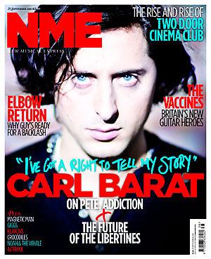
This cover seems to have a lot going on when you look at it, the front cover seems busy with a mixture of coloured fonts, a masthead and a sadistic looking man in the background.
The fonts and colours stand out a lot on this front cover, a use of Red, Light Blue and White stand out well against the dark background. These colours are quite innocent, with the line reading; "I've got a right to tell my story" as though this person has been silenced for a period of time. A main use of the colours on this cover would be to really catch your eye. The words Carl Barat are in big capital letters and have a light shadow behind them. This helps to bring the letters out into the foreground more and show that NME have an important interview inside. These 2 words also stretch across the entire page meaning they are very hard to miss. The text seems very unorganised and different things are thrust across the page with fonts that don't seem to keep in any type of pattern. Bits of the stories at the side cover Carl Barât's hair which also makes the cover seem messy.
The image behind the text is very bold, you are drawn into Carl Barât's face immediately and especially his eyes which seem to have an angry glazed look on them. The background of the image is fazed out and so too is his jumper and neck, with his face being the only part of the picture not distorted in some way. His skin tone is very dull which helps draw you into his blue eyes which are in some ways mesmorising. The fact the eyes are at eye level when you look at the magazine could have a sort of hypnotic effect where you then want to have a look and see what is in this issue. Or this is what NME hope for, the cover is overloaded with text and a blurry picture which distorts your eyes. The cover might draw you in but when you actually try to look at the information it is rather hard to concentrate on one specific area as there is so much on the cover.
I personally don't really like this cover as I find it is very jammed with information and if it was a bit simpler would be more effective at making me want to read inside. The cover might have eyes that draw you in but the surroundings are too full with text which makes the cover seem overloaded.
Sadly I don't agree with your assessment at all. I am in complete opposition to your theory. The fact that the cover is just as you stated makes me WANT to immediately grab it and see what is inside and what he has to say. I can't wait to get my hands on this mag and on his new book.
ReplyDeleteIf you have read my analysis you will see I say that there is too much going on for my personal liking. Some parts draw you in I will admit but my opinion is that this cover has too much going on to give the effect that NME was hoping for. If you want me to criticise your work please send me a link to an article you have done and let me express my opinions there about how I find the cover too much.
ReplyDeleteBent out of shape much? Sheesh. Anyway.... Since I am not familiar with your blog and only received an email about it because you mention Carl. I must say thank you to you for that, if it wasn't for you I would never have seen the mag since I live in the US and NME isn't a mag I am familiar with. Once I saw it though I immediately went onto their website and purchased the digital copy of it. So while you don't really have much to say about him that is positive all the things you complain about those are the points that I love. And since I don't work for NME I'm not sure of what they were trying to express but whatever it was it worked for me. So have a great day...
ReplyDeleteYou get emails about Carl Barat? Oh wow, I'm so chuffed for you really I am. Have you read my other article where I go on to comment how boring the interview is and how much of a wasted time they spent interviewing him? Mate you might have just bought the digital copy but it's money wasted, you would be better off with a bottle of bourbon and renting Brokeback Mountain.
ReplyDeleteBeing a girl and not needing to state my sexuality and that I leave the females of my family alone, as stated in YOUR profile I don't think it is I that needs Brokeback Mountain and bourbon. Might I also suggest for your viewing pleasure some KY? Anywho This will be my last comment. I personally don't need to spar with Children.
ReplyDeleteIt's an in joke love for people in our county in England would get. Considering I am male and heterosexual as I have stated in MY profile why would I want to indulge with Brokeback mountain? I suggested it because it's a well known American film and Bourbon is a well known. I am glad that is your last comment as I personally find it rude to judge someone's A Level work when they cannot deliver anything of the same level themselves.
ReplyDelete