About Me

My photo
Jamie, that's my name. I'm a Norfolk meterosexual who likes women outside his own family.

Monday 27 September 2010

Music Magazine - Image Collection

Conception


For my music magazine I would want to have 3 artists on the front, I would say either 3 singles artists or one trio group. The main artist would be in medium closeup to show themselves off, I would maybe want a prop, something like a guitar. Then in parralell behind them, to the right and left, I would want 2 artists to be leaning on a prop and to be in Medium Long Shot. This would show the focus to the main artist.


Framing and Composition


I will take quite a few shots, maybe with all the subejcts together but then I would also want them to be seperate so if there is anything that needs changing on the subjects first I could do that.


Shot Distance


I will take the shots multiple times to ensure they are of good quality, I want the main image definately to be in Medium Closeup and have at least 2 artists to the left and right in Medium Long Shot. If I have 5 artists I would set them out to be in a triangle or pyramid shape with the point being the focal image, the extra 2 artists would be in Long Shot.


Mise en Scène


I want to edit them to be black and white, and taking the idea from my school magazine have a bit of colour from the image on the front to give that the focus attention. This could be a person, an item of clothing or just a prop within the picture.


Photoshop Practise for School Magazine - Editing a Student (Images)

The images go in left to right from original to finished edit.
1. Original Image.
2. Cut out Image.
3. Brightness touched up.
4. Shadows changed.
5. Finished edit.


The last 2 images are larger than the others to try to show where on the face has been edited. look closely at the right side of the face, a few blemishes were re-touced.

Photoshop Practise for School Magazine - Editing a Student


I started off with an image of a student against a whiteboard so it had an easy background to cut her out.

My next step was to then cut her out from the original image, I transferred this to a new document and copied it as a layer with a transparent background so it means it can be easily put onto a magazine.

The picture I now had was cut out but I felt it was a bit dark so I took the Brightness to 83 and the Contrast to -39, this made the student's features more noticeable which is better for a magazine cover.

I still felt the image's colours were a bit dark so I then decided to edit Shadows/Highlights. I had the Shadows at 72% and Highlights at 0%. I felt this worked well as it made everything that much brighter and easier to see.

The last thing I did to the image was to touch up little areas. If there were any noticeable spots or blotches I re-touched those by using the Eye-dropper tool and getting the same colour as the other areas and then air brushing on that colour in small amounts, not so it was obviously noticeable.

I then had a finished image which would be ready to go onto a magazine.

The rest of the images will be in order on a seperate post.

Sunday 26 September 2010

Classic Rock Review


Classic Rock is a British music magazine dedicated to the radio format of Classic Rock, it started out in 1998 and is a monthly magazine, very much like it's sister magazine, Metal Hammer. The magazine comes with a free Cd each issue, very much like Metal Hammer, it costs £4.99 and is 146 pages long. I am looking at the 150th Special issue for October 2010. With this edition you get a free 15 track Cd with the best new bands out there at the moment.

The front cover of Classic Rock is effective but simplistic, it uses a good colour scheme of Gold, Black and White, the mast head stands out very well and the main image for the 150 greatest debut album also stands out well. In the shops the Cd case is attached which adds to the attractiveness of the magazine. There is a very small use of Red, which is accompanied by White. The magazine is normal A4 size and has a glossy front, because of the glossy cover and the colours it shimmers in the light meaning that the magazine has the look of being 'holy' and a good buy for the consumer. It is more of an mass market product than Metal Hammer which is very much for a Niche Market, there are many listeners of the Rock genre so it's important many people like the magazine. From this front cover I can learn that if you get the finish right it can have positive feedback with the buyer.

Again like Metal Hammer you don't get straight to the contents page, there are about 6 pages of adverts, then again like Metal Hammer the contents is spread out on 2 pages which aren't double page spread. The contents for Classic Rock has 2 big pictures of something important to the left or right of the actual contents, the fact the contents is just one long list doesn't matter so much because of the big pictures. The first page of the contents is the big stories of this issue then the next page is the things that occur in every issue.

On the way to the main article there are a lot of adverts to bulk things out, these are all relevant things to the Rock industry.

The main article is about the top 150 debut albums of rock artists, there's no actual order to them which is quite good, as it doesn't create a conflict when reading it and satisfies everyone with the choices somewhere along the line. The article is also split into a few pages meaning it's not too much to read and you get an artist interview in the middle. I think this is a good idea because people don't get too bored with the article.

I like this magazine a lot, it's rather simple and has quite good articles, I will try to base my double page spread on their idea by having things spaced out into small bits of text so the reader wants to read on.

4/5 Rating

Picture Source: http://www.classicrockmagazine.com/news/the-new-issue-of-classic-rock-is-on-sale-now-11/

Metal Hammer Review


Metal Hammer is a british Metal magazine, it was first released in 1986 and is a monthly release. It costs £4.25 and 138 pages. Metal Hammer always comes in a plastic wrapper as it contains free gifts, though these seem to be the reason for the high price. I am looking over the October 2010 issue of Metal Hammer which has Avenged Sevenfold on the front cover. Inside the plastic wrapper you get a free Iron Maiden sticker, a book about Dave Mustaine and a 16 track Cd. It is aimed at a Niche Market for heavy metal fans and maybe emos depending on their tastes.

When you look straight away at the actual magazine the first thing you notice is the colours of the magazine, the background is a firery orange which really catchers the reader's eye a lot better than magazines like NME. The magazine has a glossy cover and is a normal A4 size for a magzine. The front image is of Avenged Sevonfold, and there is a lot of detail in the front cover. In the background there are helicopters and bikes along with explosions, which cover the bottom half of the word Hammer in the title, but still make the title noticeable as it is white/grey. One main detail is hard to spot, the lighter which lead vocalist M. Shadows is throwing away has the years 1981 - 2009 on it, which is significant due to the fact they are the years former drummer James 'The Rev' Sullivan was alive for. The 3 main colours are orange, black and white. From this front cover I can learn that the contrast with bright and warm colours works well with very dark colours.

You don't immediately get to the contents of the magazine as first there is a Kawasaki Motorbike advert. There are 2 pages for the contents in Metal Hammer, but they are not on a double page spread, on page 3 there is a band advert then page 4 you get an entire picture for one page, this means it is something that Metal Hammer wants you to go and read. When you turn over the page there is a long and rather unexciting list of what is in the magazine and then a few pictures at the bottom. On the same page as the contents there is a letter from the editor, which is quite interesting reading and a nice addition to a boring contents. I don't like this contents page very much as the list gets a bit boring.

In the lead up to the main articles there are some interesting pictures that catch your eyes, immediately after turning over from the contents you see a woman eating bloody flesh in fron of a laugh Alice Cooper, this is eye catching and make you want to read the little paragraph on the page. Though disturbing it's rather cool.

Turning to the main thing from the contents and it is about the most Metal Horror Films EVER! I think these are good little pieces, it's not too much to read and it's rather fun reading on the most metal horros films, there are pictures for pretty much ever film and it gives you a little synopsis. This is good to have in a magazine as it links medias of music and film. Having the films in there then gives them good publicity for this type of market. You also end up reading them and thinking, 'Oh I've seen that film.' or 'Oh I might go check that out.' I think this is a good piece to have in as it doesn't get too boring unlike a full band review all the way through the magazine.

I think Metal Hammer is very good, it has a good variety of articles and some interesting ones at that, I prefer this a lot to NME. The front cover is very catching and it's nice that it is glossy. The fact you get gifts with your magazine also helps to attract customers. From this magazine I will take away teh idea to make my articles short and snappy so not to get too bogged down, to also have interesting pictures which makes the reader want to have a look at what is going on.

4/5 Rating

Picture Source: http://www.metalhammer.co.uk/magazine/

NME Review


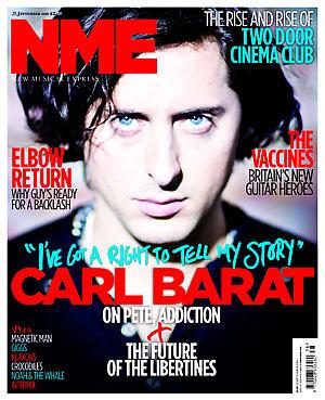
NME stands for New Musical Express and is a weekly magazine which has been running since March 1952. The current magazine costs £2.30 to purchase and has 66 pages. I am specifically looking and reviewing September 25th 2010 issues, which has on the front Carl Barat.


Starting off by looking at the magazine in general and the front cover I notice that NME magazine is about 1cm wider than most magazines, and seems a lot thinner. This week's front cover has Carl Barat on it, I personally don't like this cover very much. The colours are used well, the main ones being Red, Blue, White and Black but I think the image in the background is not very well edited. I think that the contrast is a bit off, and makes everything look out of focus. I think that NME want everything to be out of focus so you focus on the face of Carl Barat but I personally don't like this approach. I think the white boarder around the magazine does work well. If I had to take a tip from this front cover on how to do mine it would be to have the words in bright colours, Red is very good to use.


The Contents page I think works really well. It isn't a long list which gets boring it has different images spread out across the page, with the pages not in order (having page 1


2 on the right and 36 before it in the middle). I think the contents works well because it has a white background so the images stand out well and then all catch your eye to the big stories that NME want you to see. With the pictures go some quotes from each article and a small insight into it, which doesn't give too much away but gives you a taster to go and read on. I also like the fact that the rest of what is in the magazine is in a very small column with just their headlines, these seem to be weekly things. For NME it's a good way to make sure the reader goes on to look at these as they don't know what they are so will be intrigued to look at them. NME is also very crafty, as the only time Red is used on the page is to attract the audience to a subscription to the magazine. I like this contents page, it's rather simplistic but at the same time eye catching.


Through the pages there are a lot of adverts to help bulk the magazine out, these adverts are for music and fashion based at the type of reader who likes NME, these tend to be very Indie adverts.


The main article on Carl Barat I found to be rather boring. It had a lot of q


uotes from Carl but at the start I found it to be dull, I'm not a fan of The Libertines so this isn't really my kind of article but the first few paragraphs seemed to be more of an autograph than an interview. I would have expected an interview to be talking about the new solo album Carl is releasing in October but it starts out differently. The picture to the right I also didn't like due to the blur on the gun which actually made me feel a bit dizzy to look at. On the next double page spread there was a nice big timeline of Carl's work, I liekd this feature as it wasn't too deep but gave you snippets into his career, and kept you interested.


In general I didn't like this magazine very much, the paper itself felt more like a newspaper and I didn't really enjoy the other articles. I foudn the size of the magazine to be to wide for my liking. When I do my magazine I will try to base my contents page like there's without copying it, I will also make sure I use bright colours on my front colour for key words.


2/5 Rating


Picture's Source: http://www.nme.com/magazine
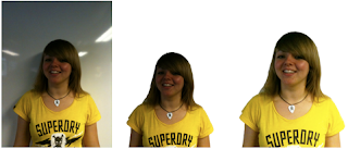
Friday 24 September 2010

Third Magazine mock up for preliminary task - School Magazine


This is my attempt at my magazine cover, as of yet I have not put my own images onto the cover but I have edited the second attempt.

Different from the second attempt are the font types and I have changed one of the stories and images/shapes. With the shapes I have taken out the love heart with the story of Teacher Love as I felt this to be tacky in comparison with the rest of the magazine. I changed it for a softer picture of a timetable and changed my story to being about Timetable Much Ups. I kept the star in as it seems to be more in keeping with the tone, having only one shape means the magazine doesn't end up looking too tacky.

The font has now been changed from Times New Roman to Broadway, I did this because Times New Roman is very common and is not often used in magazines, Broadway is eye catching and I think it works well with my magazine as a whole.

For my final design I will be making the images my own and trying to get the layout correct for the final time, and tweeking out any mistakes that I find.

Tuesday 21 September 2010

Lemmy - The Motion Picture


When you talk about Rock 'n' Roll you think of the big bands, Black Sabbath, AC/DC and of course Motörhead. This week we heard an update about how a film about Lemmy Kilmister the lead vocalist of Motörhead is coming along.

The Director and Producer told AOL this week about funny insights into the movie and how it is coming along. They said that they recently did extras and bonus material which took 32 days worth of filiming in midtown Manhattan.

There's going to be a lot on the DVD just for the fans like an extended version of Lemmy's live jam with Metallica and some 'Borat style pranks' filmed with Motörhead guitarist Phil Campbell. They claim this is going to be great stuff.

Though it all seems like 'hard work' the Director Greg Olliver laughed how after drinking in Las Vegas he found Lemmy at the slot machines and Lemmy, of all people told him to 'get away from him' because he was drunk. Things like this might give us a good insite into the film being a cracker with good music and plain old fun.

I think the film be a big hit with rock fans, Motörhead who are signed to SPV have been going strong for 35 years now, so it will be a real insite for fans. I go to see Motörhead with a good friend in November and I can see us both rushing out to catch Lemmy's movie as soon as it is released.

Source: http://www.antimusic.com/news/10/sep/21Lemmy_The_Movie_Coming.shtml
Picture Source: http://www.nightmarevue.com/content/wp-content/uploads/2010/07/lemmy-poster.jpg


School Magazine - Image collection

Conception


I would want a high angle picture of the school to make it look impressive and dominant. This would help get to the mass market of the school, as it makes the school look big and important and could catch the audience's attention.


Framing and Composition


I am planning to take multiple images of the school, all at different high angles. This way I can see which image would work best to use on my front cover for the school magazine. In the mulitple shots I will rotate the camera so I get different angled shots, but still the school being at a high angle.


Shot Distance


To make sure I get clear shots of the school I will take 5 different shots at the same angle but then at different distances. I will take the images from 1m to 5m away from the building, I think that I will use a further away shot of the school because it will make the school looker bigger and include more of the building.


Mise en Scène


I will edit them in black and white so thing in the foreground over my cover will stand out.


For all my images I will not use zoom, as this spoils the picture quality.

Monday 20 September 2010

Second Magazine mock up for preliminary task - School Magazine

This is my second attempt at my school magazine cover. From my last magazine cover I have tried to steer away from the title page looking more like a magazine cover than newspaper. I have used my created logo to work well with the mast head.

The fonts I used I felt worked well again with a school theme, I cut them down from 3 and now use 2 font types, Times New Roman and Tekton Ext. I thinks this are a good association of school writing. For my background I have decided to use a picture of the school, like this picture on my mock up magazine I wish to edit it so it is black and white, that means that my words and images will stand out from the cover better and attract the audience.

I haven't tried to go over the top with the colours, I have the colours from my images (these are mock images) but my main colour scheme would be red and royal blue to work with the old Smithdon polo shirt colours. Then have black and white so it makes everything seem quite simple but effective.

I have used different shapes to also attract the attention of the audience, a few stars and a love heart work well as they are big recognisable shapes. As a final way of attracting the reader I have included a free ruler with the purchase of this magazine.

In an attempt to improve my magazine I think I will get rid of a bit of the stuff off the front cover as at the moment it seems a bit overloaded and a simpler design could be just as effective if not more.

Tuesday 14 September 2010

My Design for Logo for school magazine

For my School magazine I decided to do a magazine about Smithdon because I have been there for 5 years now so it's quite easy to do a piece on it.

For my magazine I had to create a logo and so have gone with 2 main attempts, they incorparate the colours of Smithdon, Red and Royal Blue/ Navy and the initials of both the school and my magazine's name.

I used the software, Sketch on a MacBook to design both initial logo ideas. The first idea was a simple SHS which I used a normal brush feature then thicken
ed out the top bits but left the base curved to give it a writing style effect. There are 2 main colours and the logo is built up of 5 main shapes. For a first attempt I think this was quite good but a tad boring so could be improved to give it more flare.

For the second design I built on my first but made the shapes tighter and sent the H shape to the back as to make the S shapes stand out. I kept the S shapes very much the same but brought the S on the right up a bit the make the title look slanted. The H shape I edited differently, I cut a notch into the top on both sides to add a bit off flare to the image and then dragged the line on the right of the H down leaving it with a dot at the end. This added to the idea of a sketch design or handwriting, something which is often associated with schools.

I think for the school magazine I will keep the second edit as it is because it is eye-catching and integrates the school's colours and letters. I like this as a simple logo for my magazine.

Monday 13 September 2010

Pop music not so Popular for the dead

Music is an expression of who you are, so why has a catholic church in the Melbourne area in the Australia area banned pop music at someone's funeral? It's not just pop music that's been banned, rock music, sports, politically and others like metal. The Archbishop of Melbourne said a funeral shold be a celebration of someone, well why does that mean they shouldnt get the music that reminds people of the deceased, is this really fair?

The Archbishop of Melbourne has sent out new guidlines to over 200 catholic churches in the Melbourne area. Some of the most popular choices for Melbourne funerals have been banned, things such as; the signature anthem for Australian Rules football team Collingwood, Frank Sinatra's My Way and Wonderful World by Louis Armstrong.


The ban was introduced after the study had found out the football tune was Melbourne's top most requested funeral song. A church spokesman said that the ban had mixed reactions. I think that this ban is a little silly, a funeral should be a celebration of your life, and your life has been affected by music so it should be your own should what is played at your funeral. I know for sure that if Shinedown aren't played at my funeral, I'll be coming back to haunt a few people.


Source: http://www.bbc.co.uk/news/world-asia-pacific-11256843

Picture Source: http://www.remotepatrolled.com/wp-content/uploads/2010/05/Frank-Sinatra.jpg

Thursday 9 September 2010

Singer, songwriter and Bouncer?

A video of Lady GaGa breaking up a fight at her Washinton Concert on 7th September.


http://www.youtube.com/watch?v=d7KvJR34mVY&feature=player_embedded#!

Fame Monster or not, she's no monster to her fans!

This week Lady GaGa showed maybe a smaller glimmer into the kind of person she is when she cut her hit song, 'Just Dance' to break up a fight in the audience of her 'Monster Ball' tour whilst in Washington.


Though you may expect the crowd to be angry that GaGa cut her song short, she was greeted with cheers as she broke up the fight telling the 2 women not to fight at this concert. After apologising to her crowd she asked if the girls were ok and saying she didn't know who hit who first.


I think it takes someone big to break up a fight, and though it could have affected how the rest of the concert went she ultimately did the right thing. If more people in the world broke up fights it would be a better place.


After breaking up the fight she took a small time to indulge with some friendly banter, gyrating to the crowd she asked if they thought she was sexy and admitted that she prefers, 'a giant dose of bullshit' than the actual truth.


Source: http://www.music-news.com/shownews.asp?H=Lady-Gaga-interrupted-her-concert-to-break-up-a-fight&nItemID=36309

Picture Source: http://www.nydailynews.com/entertainment/music/2010/09/09/2010-09-09_lady_gaga_stops_monster_ball_show_in_washington_dc_to_break_up_crowd_fight.html

Wednesday 8 September 2010

What makes my favourite magazine, just that?


I wouldn't say I have a favourite magazine, I prefer to use other forms other media such as Television, Newspapers and New Media to read up on things, but one magazine I have had constantly has been the Chelsea magazine.


Apart from being a Chelsea fan I find the magazine appealing from just looking at it's front cover. I find that the Mast Head is never covered over by the main picture, which then makes me notice the word Chelsea clearly and easily grabs my attention. There are always 4 main colours for the front cover, silvery grey, gold, white and blue. There is always a small section of white and blue, but they compliment the other colours well and make whatever the main image is, stand out well against the backdrop. Black can often be used on their front cover as it also helps to make the main image stand out. The main image is always a standing still shot of someone important to the club, usually someone who has been interviewed for it.


The Chelsea magazine has a main setup inside with there always being an interview, results, fixtures, a top 10 (such as top 10 foreign footballers) and a fan zone. The articles are never heavy reading but for a true Blues fan they offer an insight into one of their favourite footballers. The other articles help relive great moments within the club's 105 year history, these can be captured with either quirky articles which don't remain long winded or professional photography of the key moments.


The magazine is in no way perfect, it might have a glossy front and be attracting but it can get boring and having a free copy sent to me for the last year sometimes I find myself reading them a month later. I find that interviews with the players might be an insight but I might prefer a different main story once in a while. I am also sure that many people might find the constant bombardment of adverts within the magazine to take up key space, but for the simple fact there isn't too much to include in this monthly 82 page magazine it helps to bulk it out.


I would say from reading this magazine it gives me a key idea of what to do for my own one, I know what attracts me to this magazine and can use that to my advantage. Like many big magazines Chelsea's works well to the audience, even if the articles can be a bit lack luster. In no way would I say this is the best magazine in the world, but for the simple colour scheme and layout it is attractive and not too intense. If I can produce something like this I would be pleased to do so.


Picture Source: http://i35.tinypic.com/2cnca6c.jpg

Tuesday 7 September 2010

First attempt at the layout for school magazine front cover


This is my first attempt at the front cover for my school magazine. I have incoraparated codes and conventions such as the Mast Head, news, information, barcode and more. I have used the main shapes I wish to use when I make my front cover, these include the shapes of the text I wish to use, the shapes of the images I wish to use and the star shape to attract attention for a school competition.

In my first layout I have thought about 3 main fonts I wish to use; Mistral, Stencil and Times New Roman. I think these could fit in with the theme of a school as we associate young children using stencils, Mistral looks like writing but in the future I may change Times New Roman as I don't feel it affilates with the theme as well as the other 2 fonts.

The colour scheme I have used for my first attempt is not what I will follow in the future, I will incorparate colours that relate to Smithdon's colour schemes. I will want to use 3 main colours, I know I will use red and blue but so far am not sure of the last colour.

Sunday 5 September 2010

Samsung start to fight back!


With Apple making a big hit with the iPad and Blackberry having their own plans for the tablet computer market Samsung has now introduced their new Galaxy Tab.


Samsung are entering a competitive market, the Galaxy Tab will weigh less than the iPad and be smaller but the key issue will be its price. If Samsing don't market it correctly and sell it at a battling price it might end up being a flop and another point to Apple.


The device will run the Google Android system, something Apple are not particularly happy with, having already fallen out with Google over the operationg system. It will have a capacity of 16 or 32GB and can be expandable by another 32GB, just like the iPad.


Being able to connect by 3G, wi-fi and bluetooth it's price will be a key issue, with many customers seeing Apple as a reliable source and an easy to use App Store do Samsung have their work cut out for them?


Source: http://www.bbc.co.uk/news/technology-11163687


Picture Source: http://www.guardian.co.uk/technology/2010/sep/02/samsung-galaxy-tab-revealed-ifa