
 This is my final poster for the film of my trailer.
 After creating the step 9 poster I put that on my Facebook page in order to gain peoples' opinion of my work. Many came back saying they liked the poster but that there were things they felt would be better off changed. I used the audience feedback to edit my poster.
Before my poster had a very boring ident, it was just the text saying 'After Burner' but now it is changed to a blue and purple pill shape with my new production name 'Read Studios' within it. I prefer this ident as it stands out from the page better, and is easily transferable to other media products that I create.
Another change to my poster is the girl. Before she was fully visible with a drop shadow which was there in order to show she had depth. Now the girl has a black colour overlay. I think this really works for my poster, you know very little about her there, just the impression that she is planning something and watching the male - this thanks to the tagline and film name. Her black figure can be seen pressing up to the window and isn't immediately visible. The fact it isn't immediately noticed means people have to get closer and look to see what it is, thereby attracted to the poster to see what the unknown is.
Lastly from step 9 I made my title larger so it took up most of the top of the page. I originally didn't want the title so big but had problems getting the title central due to the size of the words 'the' and 'watching'.
I am impressed with this final version of my poster.


 with it but intend to put it on Facebook to get some feedback from my peers in order to see if there could be any improvements made to it and anything that is wrong.
 For the next stage in creating my postersI had to add the text layers tomy poster. Getting the text layers right is very important as it gives away little bits of information that help the audience get attracted to this poster. With the 2 pictures there is only 1 major difference, the actor's names.
 n because he is guilty for what he has done. This could lead the audience into wondering what he has done and maybe feeling sorry for him. This is in contrast to what I intend to do with my trailer, in my trailer the male character will try to divert any sympathetic feelings people might feel for him.
 To then create a new desired effect I went to filter and render and used clouds again. To makethe clouds have more contrast and better defined edges I also used defined edges. I then used blending options to make it into an overlay layer.
 s of the shelter that I have. I then made sure on the higher layered shelter that I had eliminated the skyline as it was too bright.
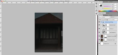


