About Me

- Jamie Read 2010
- Jamie, that's my name. I'm a Norfolk meterosexual who likes women outside his own family.
Tuesday, 13 December 2011
Monday, 12 December 2011

Thursday, 1 December 2011
Monday, 28 November 2011
Sunday, 27 November 2011
Saturday, 26 November 2011
Trailer Movie Night

After making out trailers we invited a test panel of 50 people to view our movie trailers. Having 25 males and females between the ages of 16 and 25 meant we could get honest feedback from our target audiences.
The Advertising
To advertise our event we made a poster which included all 4 of our posters on it. This was a good way of getting people interested in taking a ticket and turning up to our event. Having all 4 of our poster on it meant that if someone was interested in 1 poster they saw all the trailers on offer so we all got feedback.
Another way to attract people was to offer free refreshments. To thank the people for coming we put out some food and drink.
Feedback
After showing both the theatrical and the teaser trailer the audience said they preferred the theatrical trailer.
Trailer night
View more presentations from Reads_Daily_Media.
Music for my Trailer
The music in my trailer is a combination of sound effects from iMovie HD and the music that I made myself using Garageband software.


The Watching Original Soundtrack by MiniManJamJam
The Watching Final Music by MiniManJamJam
The list of sound effects I used are:
- Foreboding
- Scary Accent
- Heartbeat
- Suspense
- Cold Wind
On iMovie I also recorded my voiceovers for my characters. This took several attempts to get right, but once I had got the voices correct I moved them to the right positions with ease.
Garageband
Using loops
on Garageband I managed to make my soundtrack for my trailer. I used many instruments and had them at different volume levels to get the desired gothic, supernatural effect. I had the grand piano and acoustic base as my 2 loudest instruments. This helped create my repetitive spooky tune. I wanted to make it the same throughout my trailer to show that there was always a ghostly presence. By cutting the loops to the bit of sound I wanted I then dragged them back out to get a flowing sound.
The Watching Original Soundtrack by MiniManJamJam
The Watching Final Music by MiniManJamJam
Tuesday, 22 November 2011
Monday, 14 November 2011
Planning Music for Trailer
I plan to create my music either on a piano or using the Apple software, garageband.
The music will be spooky and supernatural and used as a current piece through my trailer.
Sunday, 13 November 2011
Shooting Schedule - Theatrical Trailer

This is my shooting schedule for the 14th of November. It contains infomation for the shots that I will be gathering from the filming of my theatrical trailer.
Saturday, 12 November 2011
Location
All of my pictures and videos were down on Old Hunstanton beach and cliffs. The area is quite quiet and made the setting perfect for a murderer to meet someone he has lured to him.
The location is the same through poster, magazine and trailer to keep continuity.
I originally planned to do all of my filming here I stuck to what I decided to do.
Props
I intend to use a minimal amount of props.
I plan to only use 2 props in my trailer.
I will use a scarf as a prop. This prop will be used when the killer tries to grab at the girl and she runs off.
I will also use a random plank of wood. I intend to use this as a weapon in the girl’s escape.
I plan to only use 2 props in my trailer.
I will use a scarf as a prop. This prop will be used when the killer tries to grab at the girl and she runs off.
I will also use a random plank of wood. I intend to use this as a weapon in the girl’s escape.
Trailer Analysis - Funny Games
Funny Games Analysis by MiniManJamJam
I will think about doing shots in the same way when I film my trailer. The use of text to break up clips is an idea I wish to incorporate.
Friday, 11 November 2011

Thursday, 10 November 2011
Wednesday, 9 November 2011
My Magazine Cover - Post Feedback
 This is my magazine cover after I got feedback from Twitter and Facebook. I think that I will still change a few things. The cover is lacking colour and I could add so colour to make the cover stand out better to a reader.
As the character in my trailer has a blue blazer I think I will also change this.
Feedback
Here are links to both sections of my feedback for my magazine.
Social Networking Post
Year 11 Class Post
Both of these are hyperlinks and will take you straight to the relevant posts.
Social Networking Post
Year 11 Class Post
Both of these are hyperlinks and will take you straight to the relevant posts.
Feedback - Social Network
I was pleased with the feedback from the social networking sites as it meant that I could easily edit things that I needed to with clear instructions as to what people in my target market thought.

Sunday, 30 October 2011
My Magazine Cover - Pre-feedback
This is my final magazine cover. It mainly advertises my film 'The Watching' and in creating it I have tried to stick to the codes and conventions of a real film magazine.
and in creating it I have tried to stick to the codes and conventions of a real film magazine.Codes and Conventions
When I looked at both Empire and Total Film magazine covers I realised that they contain a lot of information. This can be through pictures or text. I felt that conforming with both magazines on the amount of information I included was important. If I decided to promote only one movie to attract my target audience it would be risky strategy as not everyone likes the same movie.
I decided also that the main image should be of just one figure from my film. Modern film magazines tend to have one actor on the front cover. When I was desiging the cover I originally decided not to have any other image i.e the background, but upon closer inspection of magazine covers saw that the cover often contains an action scene or a setting from the film. Using the glass from the shelter in my poster makes the magazine look clearer and keeps a continuity with my poster.
Layout
The layout was something else that kept with the codes and conventions of a popular film magazine. I didn't think creating a layout too different from Empire or Total Film would be wise as it's now recognised for how film magazines set out their covers.
My cover contains a strip along the bottom with a couple of images of a girl. I liked this idea of a strip to promote other movies on both Empire and Total Film but encorporated the idea of having it for a D.I.Y film article instead.
Film Poster Questionnaire
Media Questionnaire Post-production My Film Poster
1. What gender are you?
Male Female
2. Which genre do you feel this poster is?
Thriller Action Horror Comedy Drama
3. How much do you like my poster?
On a scale of 1 to 10, 10 being the highest.
1 2 3 4 5 6 7 8 9 10
4. Why did you rate it with this score?
__________________________________________________________________________________________________________________________________________
5. What did you like about the poster?
________________________________________________________________________________________________________________________________________
6. What did you dislike about the poster?
__________________________________________________________________________________________________________________________________________
7. What would you change about the poster?
_____________________________________________________________________
_____________________________________________________________________
8. From the poster what do you think the film is about?
_______________________________________________________________
9. Do you think the fonts are effective, and why?
Yes No ____________________________________________________
_____________________________________________________________________
10. Do you feel that the images have been manipulated effectively?
_____________________________________________________________________
11. Would this poster make you want to see the film?
Yes No
Saturday, 29 October 2011
Thursday, 27 October 2011


Wednesday, 26 October 2011
Wednesday, 5 October 2011


Wednesday, 28 September 2011
The Watching Poster
 This is my final poster for the film of my trailer.
 After creating the step 9 poster I put that on my Facebook page in order to gain peoples' opinion of my work. Many came back saying they liked the poster but that there were things they felt would be better off changed. I used the audience feedback to edit my poster.
Before my poster had a very boring ident, it was just the text saying 'After Burner' but now it is changed to a blue and purple pill shape with my new production name 'Read Studios' within it. I prefer this ident as it stands out from the page better, and is easily transferable to other media products that I create.
Another change to my poster is the girl. Before she was fully visible with a drop shadow which was there in order to show she had depth. Now the girl has a black colour overlay. I think this really works for my poster, you know very little about her there, just the impression that she is planning something and watching the male - this thanks to the tagline and film name. Her black figure can be seen pressing up to the window and isn't immediately visible. The fact it isn't immediately noticed means people have to get closer and look to see what it is, thereby attracted to the poster to see what the unknown is.
Lastly from step 9 I made my title larger so it took up most of the top of the page. I originally didn't want the title so big but had problems getting the title central due to the size of the words 'the' and 'watching'.
I am impressed with this final version of my poster.
Poster Feedback
 I put the poster from Step 9 onto my Facebook page so I could get feedback on what I was thinking of having as my final poster. The feedback was very helpful, it pointed out some mistakes that I had made in my creation process meaning I could change them for my final poster. Here is some of the feedback.
- Martin Howard - I really like the composition of this, looks really professional. As far as feedback goes, I think you need to soften the edges of Sarah in the background, especially around her arms and hands, looks like she has a black outline. I think if you did that she would seem more realistic in the background and it would be perfect. :)
- Rex Makemson - I agree with Martin the poster is a good one with just a couple of flaws blend the girl in just her right arm and shoulder and her left arm, the boys righht hand is a bit blown out the word after has 2 'f's'. I quite like the title its bright and sharp and draws the eye.
- Robbie Dale - The poster looks good, though I'm not sure if it was your intention or not but I think Sarah's face is too clear and should perhaps make her more like the effect on the hands.
- Victoria Waterhouse - Really great poster, needs a bit more colour and the images need to be blended in a little better as they look like they stand off the page, a little. But all together, looks really professional and great :)

re 2 F's in my After Burner lettering so this was a big help for that. The contrasts in colours that people said I need I managed to have a look at too.
Colour Palette
 My colour palette focuses on 2 main colours. The main colours that I use are purple and blue, both tinted with black.
My poster doesn't conform with normal posters because the colours that I use don't juxtopose. The colours are next to each other but work well in giving the required effect of supernatural and fog.
Read Studios - Ident
 My ident is very basic, but by using drop shadows I can make it stand out.
Originally I chose to call my production company 'After Burner' but my Facebook feedback said I should have an orange flame behind the name in order to show an after burner. When I tried this is didn't work well with the rest of the poster as the colours didn't work well with the rest of my palette.
From this I decided that it was ideal to change my studio's name, and felt that READ STUDIOS was ideal as it doesn't imply it is for a specific genre of movie. This means READ STUDIOS could create any type of movie.
I created my ident by creating a rectangle and curving the edges. I split the middle and chose 2 colours that juxtaposed one and other. I used a calm blue and a lilac purple. The blue can denote calm whereas the purple denotes royalty. Using these colours make my ident look established. I coloured the inside with white to make the ident seem more professional, the drop shadows also help to make this seem like it stands off the page and is noticed well. Major companies that use idents always have an ident that can easily be recognised, mine can. I also made this into a pill shape as it can play on the subconscious as being addictive.
Tuesday, 27 September 2011
Target Audience


The target audience for my poster would be teenagers aged 16+. I would not want this to be viewed by young audiences as the plot line for my film is to do with a paedofile which is not suitable content for a child's viewing. I conform with normal movie posters by not having an age rating on the poster. The action thriller Die Hard 4.0 is a 15 movie but you can clearly see the poster has no age rating whereas the DVD cover does. If I was creating a DVD cover I would include the age as 16.
The genre that my target audience would like would likely be thrillers and horror movies. My movie tries to fall into both of these catergories.
Fonts Analysis

For my movie poster I used 3 main fonts which I downloaded from Dafont.com and Abstractfonts.com. The fonts I used are:
- Reprise Stamp - The Watching
- I Still Know - Patience is a Virtue
- Steel Tongs - All other text.
'The Reprise Stamp' font I chose because it looks good in all capital letters and catches the attention of the audiences. The text looks slightly supernatural and appears a bit spooky. Adding glow affects also means it looks paranormal.
'I Still Know' again looks good in capital letters, it looks quite an old font so that means it can appear kind of gothic. Due to the mystical themes within my trailer a spooky font is important. It suits the words of my tagline which is important.
'Steel Tongs' is a very important font. Using lower case letters turns the lower case letters into movie credits, such as : is the word, Presents. To have the actual word you type in this font it must be all in captials. The font is very proffesional for a movie poster and helps my poster keep to the normal conventions of a movie poster.
Cinema Trip - Majestic King's Lynn (27/09/2011)
 I used the feedback from the interviews with the women to try and make my first attempt movie poster. The women told me they wanted a bit of mystery within my poster to attract them to my film.
After creating my first poster I went back to the cinema to try and get some more feedback. I took along with me and A3 printed out movie poster.
I showed it to 25 people outside the cinema with many people liking it but feeling that improvements could be made.
Most people felt that it looked terrific for the thriller genre, it was spooky and gloomy which made people sense fear and terror. One person linked it to the gothic subgenre which I was pleased with.
People did however tell me that the girl in the picture didn't look realistic. They weren't sure whether she was a ghost or just watching him. One man said, "The girl looks frightening until you notice the fact that the shadow around her made her look at though she is being pressed against the window, rather than pressing herslf against it." From this comment I know I definately need to change the girl in my poster.
One person, Darren, was on hand to give me some feedback to my poster.
Darren Interview by MiniManJamJam
I am pleased with the feedback as it means that I can go away and change a few things without having to start from scratch. Darren said that he liked the fact it was 'dark' but it was hard to see everything. This means that altering the brightness should be done, but not to an extent that everything because too bright. The poster needs to remain gloomy so it is still supernatural and fits well into the thriller genre.
Monday, 26 September 2011
Other Completed Poster
 This is my other poster for my movie trailer that I made. I chose not to use this poster as it didn't look very supernatural and Sarah's ghost figure looked too photoshopped into the image.
 The trouble with this image was that Sarah did look very pale and ghostly, but her feet were too hard to insert her into the picture. Trying to scale her to the correct size was also very difficult. In relation to the shelter she kept appearing either too big or too small and everything about the image looked wrong.
I also didn't like that making her very opaque in order to looking unreal actually made her look very fake. As you could see the lighthouse behind her but she had a shadow it all looked very fake.
I wanted my poster to scare the audience, being very spooky in the process but this poster didn't capture that.
Creation of my poster - Step 9
This is how my poster looks after all the layers come together. I am pleased with it but intend to put it on Facebook to get some feedback from my peers in order to see if there could be any improvements made to it and anything that is wrong.
with it but intend to put it on Facebook to get some feedback from my peers in order to see if there could be any improvements made to it and anything that is wrong.I intend to change my poster accordingly to the feedback if I feel it is worthy of change. I will write another post about feedback to show the criticsms and then show the improvements.
Creation of my poster - Step 8

 For the next stage in creating my postersI had to add the text layers tomy poster. Getting the text layers right is very important as it gives away little bits of information that help the audience get attracted to this poster. With the 2 pictures there is only 1 major difference, the actor's names.
 The actors names are only on 1 of the posters as I wanted to compare the differences between them. The reason for the actor's names not being on both posters here is due to the fact that I felt putting them on the poster overcrowded the text layers and that there might be too much text for the poser. This is something that I will use feedback to decide on.
With the other pieces of text I have only used 3 fonts which I downloaded from abstractfonts.com and dafont.com. The 3 fonts that I used are:
- Reprise Stamp - The Watching
- I Still Know - Patience is a Virtue
- Steel Tongs - All other text.
'The Reprise Stamp' font I chose because it looks good in all capital letters and catches the attention of the audiences. The text looks slightly supernatural and appears a bit spooky. Adding glow affects also means it looks paranormal.
'I Still Know' again looks good in capital letters, it looks quite an old font so that means it can appear kind of gothic. Due to the mystical themes within my trailer a spooky font is important. It suits the words of my tagline which is important.
'Steel Tongs' is a very important font. Using lower case letters turns the lower case letters into movie credits, such as : is the word, Presents. To have the actual word you type in this font it must be all in captials. The font is very proffesional for a movie poster and helps my poster keep to the normal conventions of a movie poster.
Creation of my poster - Step 7
Step 7 involved me creating the main supernatural character, the dead gh ost. I decided that my character should be positioned behind the glass of the shelter because the male of the poster could not see her, but the audience could. The title of my film is "The Watching" and obviously this character appears to be watching the man. The tagline of "Patience is a virtue" also hints that she has time and is going to get revenge and it doesn't matter how long it takes.
ost. I decided that my character should be positioned behind the glass of the shelter because the male of the poster could not see her, but the audience could. The title of my film is "The Watching" and obviously this character appears to be watching the man. The tagline of "Patience is a virtue" also hints that she has time and is going to get revenge and it doesn't matter how long it takes.The girl is wearing normal clothes but they are just plain black, the reason she is in these clothes is because she died a normal death, in the movie trailer I will make sure she is in this outfit at least once. Both costumes the characters in the posters wear will be used in the trailer in order to keep continuity.
There is a backdrop on the girl to try and make her seem more realistic. My audience feedback may suggest this isn't so good, so for my final version the backdrop might disappear.
Creation of my poster - Step 6
In this step I added on my main male character. I had the actor looking dow n because he is guilty for what he has done. This could lead the audience into wondering what he has done and maybe feeling sorry for him. This is in contrast to what I intend to do with my trailer, in my trailer the male character will try to divert any sympathetic feelings people might feel for him.
n because he is guilty for what he has done. This could lead the audience into wondering what he has done and maybe feeling sorry for him. This is in contrast to what I intend to do with my trailer, in my trailer the male character will try to divert any sympathetic feelings people might feel for him.The clothes in this poster are very natural. The character is in no way supernatural so is wearing normal clothes. He is wearing a blazer with a tee shirt, this is smart casual, the look that I want this character to have. The jeans and trainers that he wears are also very casual. In some ways his clothes don't conform to the norm, other movies with the same type of character usually wear smarter clothes. I want my character to try to appear younger than he is as his character profile shows him to be manipulative in this way.
Creation of my poster - Step 5
The next thing I did was to add to the supernatural effect that I was craving for my poster. I started by creating a new layer, then I added a layer mask to the layer.  To then create a new desired effect I went to filter and render and used clouds again. To makethe clouds have more contrast and better defined edges I also used defined edges. I then used blending options to make it into an overlay layer.
To then create a new desired effect I went to filter and render and used clouds again. To makethe clouds have more contrast and better defined edges I also used defined edges. I then used blending options to make it into an overlay layer.I also made a purple gradient on another new layer, this I also changed into an overlay blending option. Having both of these as my highest layers meant that they went over all the other layers that I had meaning everything below these layers would appear supernatural.
Creation of my poster - Step 4
With this step I created a new layer and slotted it inbetween the 2 layer s of the shelter that I have. I then made sure on the higher layered shelter that I had eliminated the skyline as it was too bright.
s of the shelter that I have. I then made sure on the higher layered shelter that I had eliminated the skyline as it was too bright. Then using the clouds tool, in Filter then Render, I created some darker clouds that looked more like a stormy day. This was a simple but effective thing to do.
Creation of my poster - Step 3
I wanted to make the entire poster a lot darker so I decided so edit other main things in the poster. 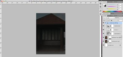
I edited; Selective colour, Curves and Hue/Saturation.
For Hue/Saturation I left the Hue at 0% and had saturation at -54. This made my image look quite grey and dull, which was the intended effect.
Next I edited the curves. To make sure that I had a very dark image I kept the curves of the line very low and straight so that there wasn't too much colour or contrast with the image.
Lastly I added a Selective Colour Adjustment Layer. I used the drop down menu and selected the colour Black. Changing the methor to relative I edited the following.
- Cyan: +1%
- Magenta: 0%
- Yellow: 0%
- Black: -4%
The image in the screen shot is what all of this editing created.
Creation of my poster - Step 2
With my original picture before editing the colour to make it look darker and more supernatural I decided that I should make there seem a little bit foggy as fog is often associated with supernatural and gothic themes. On a duplicated copy of my picture I added a vector mask and with black and white as foreground and background colours respectively, I used the gradient tool to create a thin fog effect at the base of my picture.

Creation of my poster - Step 1
The first step of creating my poster was to get the picture that I would be using. The picture that I used I got on Old Hunstanton cliff top. I took a picture of one of the shelters there as I felt it to be an ideal spot for both my trailer and my psoter. 

Poster Template 3

The main difference with this layout is that I have included the text for my tagline that I think I will use. Everything else is in relatively the same place that I planned it to be.
When I come to create my poster I migth change a few things around to see the difference and what works better with my actual images.
Poster Template 2

For my second template I decided that I should inlude the title name, actors' names and my tagline. The text for this layout is still basic as I hadn't made final choices on my fonts for my poster. I still want my image to be over the poster but the focal point to be directly in the middle and eye line.
I still want the title to be very focal to the audience. I want the font I use to compliment my title and also my genre.
Looking at many other movie posters I conform with the norm by having a central image, information at the bottom and the title at the top.
Poster Template 1
 This is how I wanted my poster to look originally. I used simple text just to outlay where I wanted everything on my poster. I wanted my image to be over the poster but the focal point to be directly in the middle and eye line.
I want the title to also be very obvious to the audience, for this layout I have not included any names for my movie as at this stage I want to learn the layout.
Looking at many other movie posters I conform with the norm by having a central image, information at the bottom and the title at the top.
Sunday, 25 September 2011
Planning Target Audience
 Looking at the genres close to my movie I think it would be ideal to make my movie rated 16. What I plan to have in it can get quite gruesome but not too gruesome that it should be deemed a certificate 18.
The type of person I expect to want to see my movie, based on the media products I will be creating, would range from a teenager to someone in their late twenties. The reason I expect this to be the age range most likely to watch my movie is because of what the movie is about and that this type of movie is popular with this age range.
I want to create my media products to be spooky and supernatural so that it is something a teenager would be inclined to see.
The picture to the right is what I believe a typical group of my target audience would look like. The person is around 17, dresses quite casually and enjoys socialising with friends. I believe that aiming my movie at the teen market is ideal as it has ideas of ghosts but also shows the audience that doing wrong means you do get a comeuppance.
Planning Fonts
The use of fonts on my poster is very important. I need to pick a font that I can use across the board on all of my media products. The target audience is 16 so the font I use must get their immediate attention.
At the moment I have 2 possible fonts that I might use for my poster.
At the moment I have 2 possible fonts that I might use for my poster.
- I Still Know - This font I intend to use for either my Title or tagline is this. It is an old looking font and fits in with the supernatural theme that I intend to try to create with my poster.
- Steel Tongs - This font help to do the credits that are used at hte bottom of film posters. Using lower case letters it creates things like Directed by and Produced by. This means I encorparate the codes and conventions without having to go out of my way.
Planning Ident
 All big companies have an ident, they use their ident to symbolise who they are. An ident is important because it attracts the target audience.
 A company like Warner Brothers uses their ident to show that they are into family films. They have WB inside a shield, which connotes unity.
Paramount have a mountain range with stars around the mountain. The stars can be traced back to the United States flag.
Universal studios aim to use their ident to show that their movies are for everyone. The word Universal and a globe which indicates that their movies are for everyone.
At the moment my studios is called "After Burner Studios" so I intend to use a recognisable font, having all my characters as capitals. I might also add a flame behind the text to symbolise an after burner.
Thursday, 15 September 2011
My Storyboard
 In this storyboard it shows how my story for my trailer occurs. This storyboard shows the story in a chronological order but for my actual trailer it's going to be different. I wanted to get my ideas down for what I wanted to do. The storyboard is thumbnail type and this was important as I wanted my plot down on paper before I forgot it.
The drawings are very rough which is ok for this starter storyboard. When I come to do my actual trailer I will change the order of everything so that it attracts the audience.
After thinking about my plot I decided to do this tumbnail storyboard so I can think more in depth about what I will do for my poster and magazine cover.
Monday, 12 September 2011
Friday, 9 September 2011
Thursday, 8 September 2011
My Genres
Thriller - This genre uses suspense, tension, and excitement as the main elements. The primary subgenre is psychological thrillers. After the assassination of President Kennedy, political thriller and paranoid thriller films became very popular. examples of thrillers are the films of Alfred Hitchcock.
Thrillers heavily stimulate the viewer's moods such as; a high level of anticipation, ultra-heightened expectation, uncertainty, anxiety, suspense, excitement, tension, terror. Literary devices such as red herrings and cliffhangers are used extensively. The cover-up of important information from the viewer and fight and chase scenes are common methods in all of the thriller subgenres. Each subgenre has its own characteristics and methods.
Revenge movies are also a subgenre of thriller movies and these nowadays are very popular. The Kill Bill movies are some of the most popular revenge movies around.
Fantasy - Fantasy films are films with fantastic themes, usually involving magic, supernatural events, make-believe creatures, or exotic fantasy worlds. The genre is considered to be distinct from science fiction film and horror film, although the genres do overlap. Films in this genre range from Elf to Nanny Mcphee.
Tuesday, 6 September 2011
Different Types of Storyboards
1. The Thumbnail storyboard - This is where you draw your storyboard all on one or two pieces of paper. For each shot in your proposed film, draw a little sketch, about the size of a postage stamp. Even if the drawings are barely legible it is ok as the point is to be able to get your ideas down on paper as quickly as possible.
2. The Floating storyboard - This is where you draw sketches of your scenes without rectangles around them, they are just floating on the page. When you're in the early stages of developing your images, this is a free-form way to work.
3. The Framed storyboard - This storyboard is where you draw your images inside of fixed rectangles. This here forces you to think carefully about how you want to compose things within the shape of the screen that your film will be displayed on.
4. The Photo storyboard - If you have some puppets and sets done, you can make your storyboard images using a digital camera. With the camera, you don't have to worry about aspect ratio as the device imposes a frame around the image.
Location Shots
 These are the location shots for where I want the main part of my trailer to be shot. The glass behind the bench I want the dead girl's ghost to appear looking pasty and ghastly. On the bench I want her killer to be sitting, as the ghost of the girl sets her sights on revenge.
My Moodboard
 This is my moodboard. The things on my moodboard include specific places I wish to use in filming, things I want to be in my trailer and things that I think would be a good idea for my trailer.
I created this moodboard on Adobe Photoshop and collected the images from the internet. I decided to create a moddboard for my trailer before the production of my poster because I wanted to get an idea of what I would use in the trailer, so I had ideas of what to put in for my poster. In order to conform with current film posters using the same location in both my trailer and my poster are important. It is a way of keeping continuity throughout my media creations.
The pictures of the hut, cliffs and church are exact locations I intend to use in the filming of my trailer. The gravestones and trees with fog are not settings I will actully use but ideas for settings and weather.
The face and the girl are not characters I intend to use, but moulds of characters. The man crying is one idea I have, a way to show my main male character as feel guilty for what he has done. The girl is a ghost, she is cut from the movie, "The Shining" and on Photoshop I have made her more opaque so she appeared more like a ghost. I might use this technique in my poster to show the girl as being a ghost.
They Wait - Film Poster Analysis

The reason that I chose this film poster is because it's main poster is of a child and the film itself is a drama that contains ghosts and is about setting things right.
1. The picture shows the person crying blood. Blood and red are there for pain and danger. This shows that this is horrofic in some way.
2. The font is all in captials, it has a red stroke round the edge to make the text stand out and to warn of danger with whatever is waiting. They appears to be an opaque set of Chinese lettering behind the main letters. This could be a hint as to a Chinese force being what is waiting.
3. Here you can see there looks like the person's spine, which looks really injured. It makes the person looked trapped and maybe paralysed from other forces. The rest of the bottom of the poster appears old and worn, giving detail of the supernatural force in the movie being something ancient.
4. Here you can see the lips of the person sewn up, it makes it looks not only horrific but again like the person has no power or control to do what they like or should natural be able to do.
5. Here you can see the eyes of the person, therby knowing that they are alive and not dead. The fact that this person still shows life makes the poster more suited for the horror genre due to the fact that a live person is being treated this way.
The Lovely Bones - Film Poster Analysis

The reason that I chose this film is the fact that this movie is a very much like mine in the fact that a young girl has been murdered and looking for redemption. The genre of this movie is both drama and revenge, something mine would be. My movie will be more horrific in the sense of how the girl looks for redemption but I felt this was a good movie poster to look at in contrast to the darker way mine will be.
1. The title and font for this is all written in capital letters, to try to get to the attention of the audience. The word 'Lovely' is in bold, this is again to get the attention of the audience. It gives an audience a clue that the girl could be very lovely and also could be quite ironic due to the fact she was murdered, something very awful.
2. The girl in this film poster looks sweet and innocent. From the clothes that she is wearing it looks like a winter's morning, her face looks shocked to see the figure standing across from her and her colours in her clothes are happy colours. The colours show life, where as the the figure all black could symbolise death.
3. The setting for the poster is a corn filed, the colour of purple doesn't seem too natural but it adds an air of mystery to the meeting of these 2 people. The ground looks dead, another tell tale sign that it is likely to be winter time. The colours of the sky also make it seems like sunrise. The lighter yellow is on the half with the girl and the darker purple is with the blacked out man. This good be a contrast of good and evil.
4. The man is wearing a coat and the rest of him appears to be blacked out, this makes his character a shaded one, it hides who they really are from the audience. The total colour of black makes him mysterious and made to look a bad person.
5. The sky is where the 2 contrast colours clash. This is the contrast of good and evil. It makes the poster seem more realistic too.
Thursday, 21 July 2011
Hot Fuzz Poster Semiotic Analysis
 Hot Fuzz is a popular 2007 British comedy movie starring Simon Pegg and Nick Frost as 2 Police officers who make a giant discovery within the small village of Sandford which is controlled by the local Inspector (Jim Broadbent). The movie is the second in the Blood and Ice Cream Trilogy. The vanilla Cornetto representing the Police force and in Sean of the Dead the Strawberry flavour representing the bloodshed and zombies. Written by Simon Pegg along with Edgar Wright it was distributed by Universal Pictures and recieved wide acclaim.
The colour scheme for the poster is; Blue, Black and White. The black and white are juxtopostion with the white denoting innocene and purity and black being mysterious and death. The use of these colours not only fits in with the colours of the Police uniforms worn but it also forshadows the events of the movie. In the film the Police are supposed to be good, clean and upholding the law but the entire way through there is an air of mystery surrounding the Police force and their lack of co-operation. Blue can often denotes calmness, something that the Police force are supposed to help create in a community. However Hot Fuzz is not calm, and it is the Police force that use a lot of violence.
The font used on the text is all written in capital letters, a way to attract the audience and help promote the movie. With both Pegg and Frost being popular actors in the Uk their names help to promote the movie. The text along the top goes against the colour used. With white being used you expect it top be innocent text but it actually mentions the violence of the movie. Hot Fuzz appears to be written in letters used on Police badges and uniforms, this helps to show the audience is a movie about the Police force. The middle of the O also includes the Sandford Police logo.
The clothes worn by the characters is standard Police uniform but the guns held in Simon Pegg's hands are not usual to be seen for the UK Police force. This is a way of showing hte audience that this movie is going to be different, maybe try and show the UK Police as being something more than many percieve. The bullet vest and sunglasses make Pegg's character seem emotionless, cool, calm and ready for action. He is looking to the ground which is a great way of showing power and eliminating emotion from this image. Both characters look very serious and as this isn't normal it can easily intrigue the audience into wanting to see this film.
Milk Poster Semiotic Analysis

Milk is a 2008 American film which portrays the life of gay rights activist Harvey Milk, the first openly gay man to be elected to the public office in the state of California. This film was produced by Momentum Pictures and Sean Penn's staring role in this biographical movie won him an Oscar for Best Actor in a Leading Role for his portrayal of Harvey Milk. Though being nominated for 8 Academy awards it only won 2, the other being for Best Original Screenplay.
This poster uses 3 main colours; Grey, Blue and Brown. These colours all compliment each other for none of them are too contrasting. The colours work well for this poster as they denote Sean Penn's character to be smart, intelligent and serious. The movie is about the rise of Harvey Milk's political career as a gay activist, so the character needs to be shown to be serious and this colour scheme does that well.
The fonts used in this poster are clear to see, all of the text is written in capital letters to attract the audience's attentions. The word Milk has a faded use of blue, with small pieces of white seeping through the letters. As the case of Harery Milk was very important at the actual time this could done to show Milk being a newspaper headline. Another reason could be that it is an old case so the letters are faded because this has been a long time.
The way that Sean Penn is dressed up is very serious and on the left of his waistcoat he has a blue badge that says, 'Harvery Milk'. This badge is like the badge someone campaigning for a political position would wear so it keeps in context with the political career of Milk. The smile of his face is there to show Milk as a happy candidate and to make the audience see that he is a likeable character.
Wednesday, 20 July 2011
Film Posters

A film poster is used to advertise a film. Studios often print several posters that vary in s
ize and content for various domestic and international markets. They normally contain an image with text. Today's posters often feature photographs of the main actors. Prior to the 1990s,illustrations instead of photos were far more common. The text on film posters usually contains the film title in large lettering and often the names of the main actors. It may also include a tag line, the name of the director, names of characters, the release date, etc.Film posters are displayed inside and on the outside of movie theaters, and elsewhere on the street or in shops. The same images appear in the film exhibitor's pressbook and may also be used on websites, DVD (and historically VHS) packaging, flyers, advertisements in newspapers and magazines, etc.
Film posters have been used since the earliest public exhibitions of film. They began as outs
ide placards listing the programme of (short) films to be shown inside the hall or movie

theater. By the early 1900s, they began to feature illustrations of a scene from each individual film or an array of overlaid images from several scenes. Other movie posters have used artistic interpretations of a scene or even the theme of the film, represented in a wide variety of artistic styles.
Friday, 15 July 2011
Cinema Trip - Majestic King's Lynn (15/07/2011)
Before deciding what genre my trailer should be in I thought that going to my local cinema and looking at film posters would help me decide what to do.
Whilst I was there I interviewed 2 women who were 17 and 23 respectively. They told me their opinions of movie genres and what they like in a movie poster.
Cinema Interview 17 Year old by MiniManJamJam
Cinema Interview 23 Year old by MiniManJamJam
The films that were out at the cinema at the time I went were; Transformers Dark of the Moon,
Green Lantern, Harry Potter and the Deathly Hallows Part 2 and Bridesmaids. Reviewing the interviews with the women the things they said meet conventions of film posters. Characters from the films are prominent on these posters. There is a sense of mystery with all of the posters apart from Bridesmaids. I think that when creating my poster I should think about what the women said and try to follows codes and conventions already in posters.
Subscribe to:
Comments (Atom)